Goal 3
Establish trust and working relationship with client
Discovery and Goals
ultraPacer is a passion project built and maintained by its founder, Danny. The tool was already powerful, but it was in need of foundational improvements to better serve its existing users - athletes - before it could expand to serve other types of users or add new functionalities.
The tool’s existing functions included creating plans, creating courses, browsing and bookmarking (“pinning”) existing courses, and comparing Strava or recorded GPS activities to a plan.
My first meeting with Danny revealed the following about priorities for Danny and his users:
User engagement mattered more to him than generating revenue (for now)
Danny prioritized desktop experiences
this was because of early analytics and untested assumptions about user needs
Most users relied on existing courses in ultraPacer’s database to create plans
Danny frequently created courses upon request, as most users preferred not to create their own
With an understanding of Danny’s goals and his users’ behaviors, I set three goals
Goal 1
Align dashboard design with actual user behaviors
Goal 2
Position ultraPacer to expand into new areas


Hierarchy
message and layout both prioritize creating a course over a users’ plans
created courses are prioritized over “pinned” courses
User behavior indicated this order of importance:
Missing “Pinned” space
unclear location of “pinned” items in this layout
items are organized by creator rather than expected use
Nomenclature - “pin”
renaming a common convention - bookmark - is potentially confusing
“pin” also refers to a point of interest on a map - a notable feature of the course page; using the same term for multiple important features could also create confusion
Nav bar and information architecture
Related items like “Races” and “Search” are separated, as are “Membership” and “User”
contact links in upper right, where “user” and “help” are typically found
no footer

I wanted using ultraPacer to feel intuitive, familiar, and straightforward, so I looked to the most popular running tool for inspiration: Strava
User profile widgets
Feed with activity cards - centered and double-width for emphasis
Bookmarked and user-created courses appropriately prioritized by relative size, placement, and ordering
Conventional footer with contact info, privacy and cookie policies, and copyright -
Simple copy introducing core features
Filter for central feed
Advertised extra features to expand engagement
Rebuilding a Dashboard
The onboarding message and dashboard from December 2023:
ultraPacer Athlete Dashboard Re-Design
Overview
ultraPacer is a web tool that helps ultra runners create plans for races and long runs. The tool uses course data and runner preferences to generate split-time tables, which users can further customize by adding notes.
Date
Dec. 2023
Sprint
1 week
Roles
Product Designer
Researcher
Deliverables
Grayscale mockups
View Live
Log in or sign up at ultrapacer.com/


Problem
The existing athlete dashboard layout did not align with users’ needs, behaviors, and familiar tools
100.2 mi
Elevation profile
Runner
A Card for the Feed
Strava’s activity card design, tailored for social engagement through customized posts, didn’t make sense for ultraPacer users, who primarily operate independently on our platform and require different information.
However, analyzing Strava’s card design helped clarify what ultraPacer plan cards should display:

Key identifiers
The ultraPacer feed is populated by the user’s own plans. Our cards do not need to identify the user/creator.
Plans are linked to a course and event on ultraPacer, and users need that information to identify plans in the feed. The card is organized with Course and event info on the left and a preview of user plans for that course and event on the right.
Key data is emphasized in bold text for easy scanning.
How long I’m running
Where and when I’m running
How hard the run is
Key data:
course name
distance
Key data:
plan setup (pacing method and target)
level of completion (notes added as final step)
Course and event
Plans for event
I used the formatting of the labels and inputs from the Strava card to add polish and a sense of familiarity for ultraPacer users coming from Strava.
Key course and event data were the exceptions because they needed higher visibility
Placeholder plan slot shows this user with a free membership can create one more plan on this course
Final Design
This was delivered as a grayscale mockup. I had (and still have) hopes of putting my aesthetic fingerprints on ultraPacer, but the focus was on the logic and function of the blueprint in this case.


I also mocked up the mobile version - ultraPacer lives on the internet for now, but its future is on the phone as a native app. It is a tool for events in remote places, and it has potential to work more flexibly during these events when it can be accessed offline
Future users
Filters and tags were added to the feed for future user roles and plan creators to give Danny a sense of how those things might further shape this tool. These users were discussed in our meeting but weren’t the focus of this initial work
Current State
These screenshots below show the dashboard in January 2025. Some small changes were made for sake of consistency after the Coach Dashboard was rolled out in Summer 2024, but it still follows the same basic logic and blueprint of the original design from December 2023
Problems solved and goals met
This dashboard design addressed everything it needed to in this first handoff:
the sizing and placement of elements matches users’ behaviors and prioritized functions
the layout is familiar to users, which builds in affordances based on their experience with related products like Strava
it is flexible enough to incorporate new elements and features while retaining its shape and familiarity
Danny liked it so much that he built and launched it the day after seeing it; this was the beginning of our on-going working relationship
Fully assembled, you get the...
Reflections
This was a great early project for me - as an ultra runner, I understand the use cases for this product and I was able to marry my passion for the sport with my skillset in UX and product design.
I adapted well to constraints on this project
I had a week to deliver a design that would earn me the trust to continue working on the product - I didn’t have time to arrange and conduct user interviews or testing. I used what I had at my disposal - insights from my first conversation with Danny about his users, my knowledge of the running world, and the resulting competitive research. There’s more than one way to arrive at a design that better suits a user’s needs.
I learned to embrace flexibility in implementation
Despite some elements changing - margins, gutters, and the height/width ratio of the card stretching responsively; some copy rewritten; etc. - my client enthusiastically adopted my design, which is a huge win. Perfect execution isn’t always possible or guaranteed, but if the final product better serves its users, the design is successful. This experience taught me to balance idealism with practicality in collaborative, real-world projects.
More Work
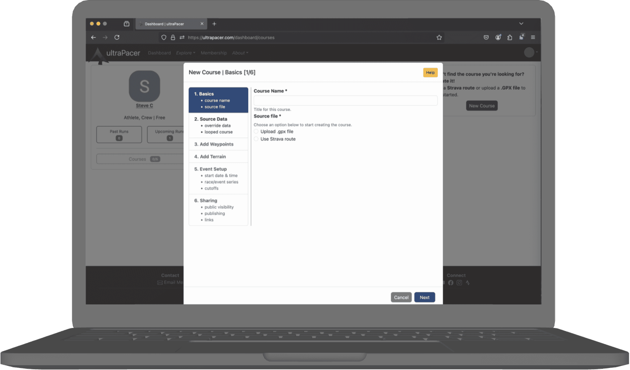
ultraPacer Course Creation
Building in better bites
Client: ultraPacer
Role: Product Designer | Content Designer
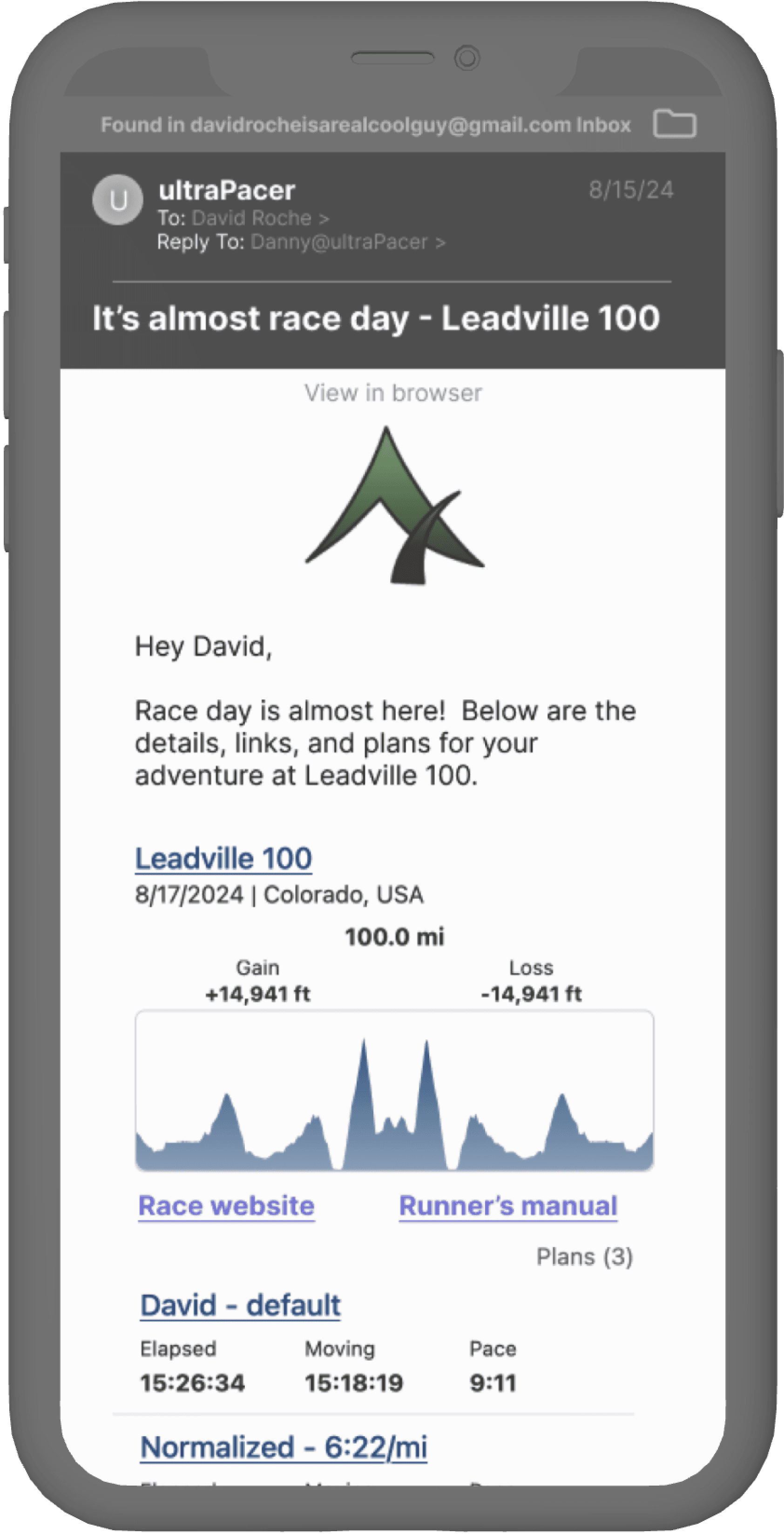
ultraPacer Pre-race Email
Getting everyone on the same sole page
Client: ultraPacer
Role: Product Designer | Content Designer
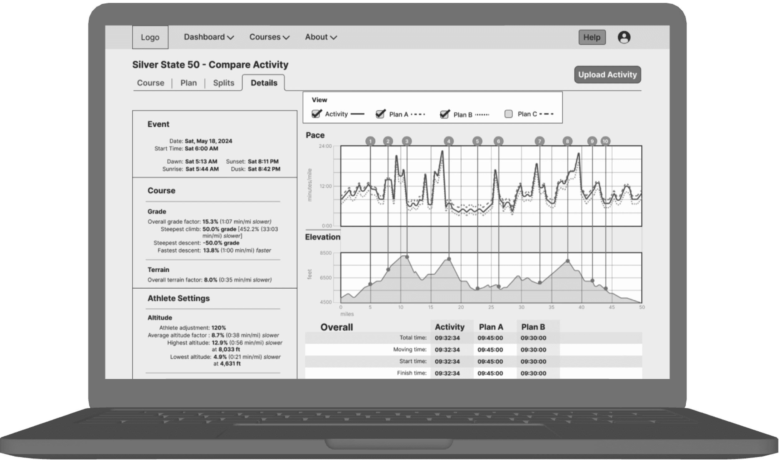
ultraPacer Compare Activity
Performance vs. the script
Client: ultraPacer
Role: Product Designer | Content Designer
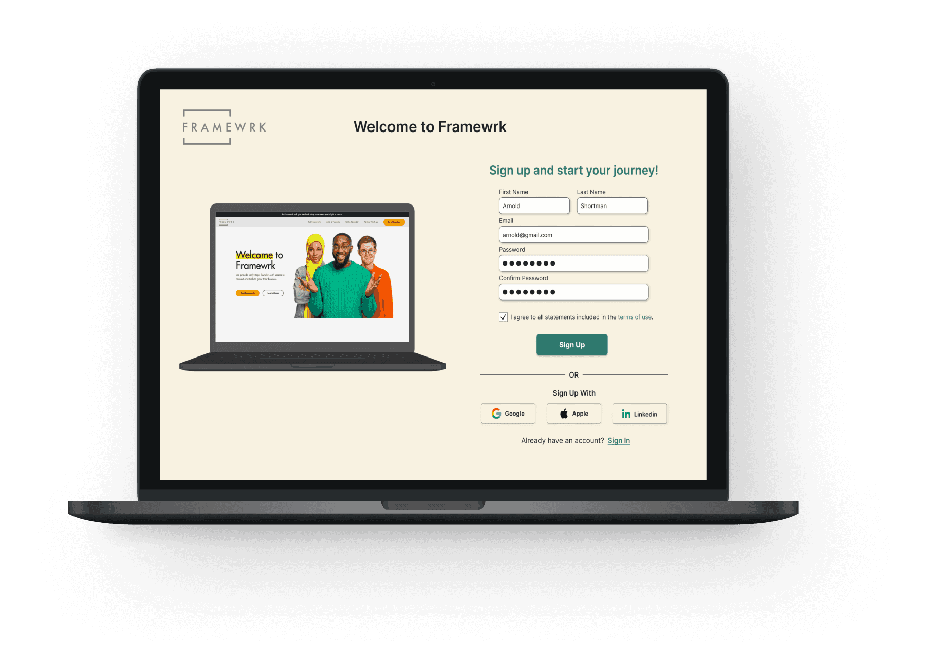
Framewrk Launch Project
Reframing a product and its users.
Client: Framewrk
Role: Product Designer | UX Researcher
Drop me a line
stevenmcastner@gmail.com