More Work
ultraPacer Course Creation
Building in better bites
Client: ultraPacer
Role: Product Designer | Content Designer
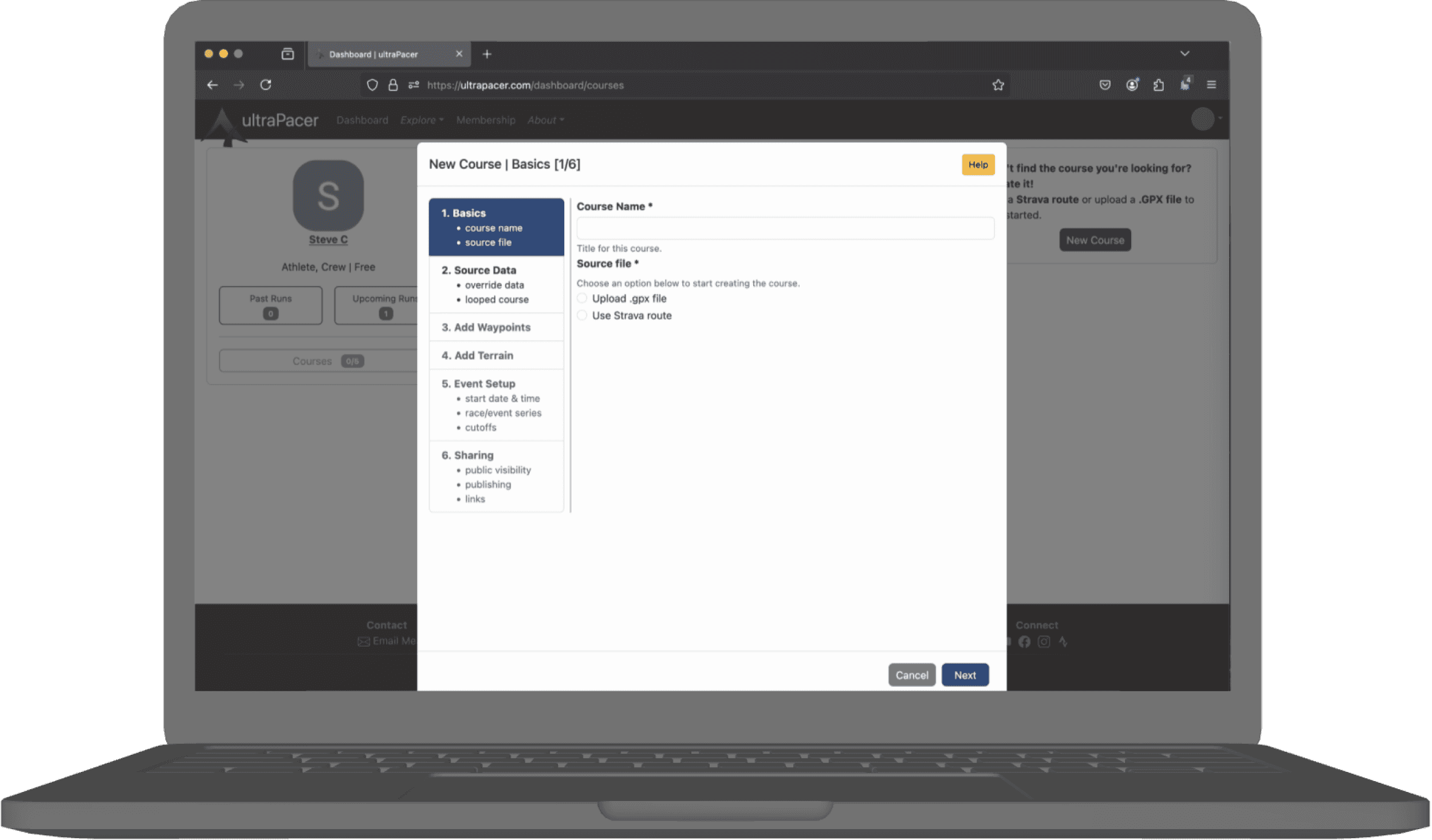
ultraPacer Athlete Dashboard
Run smarter to run harder
Client: ultraPacer
Role: Product Designer | Content Designer
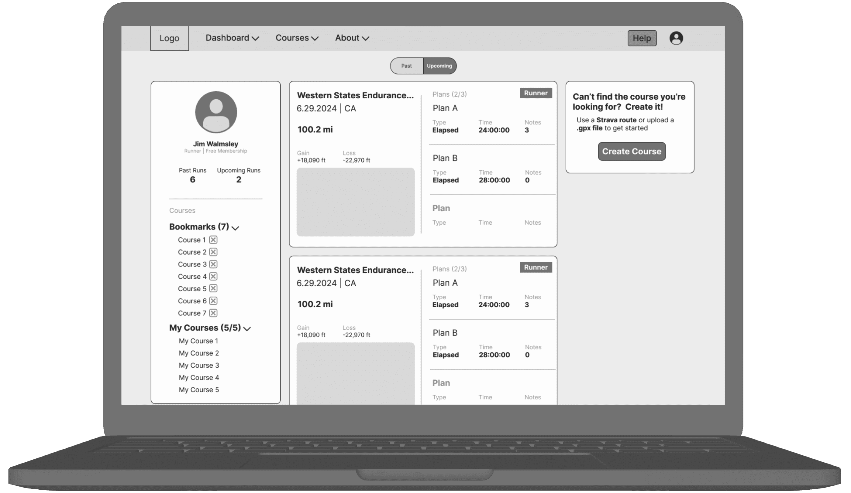
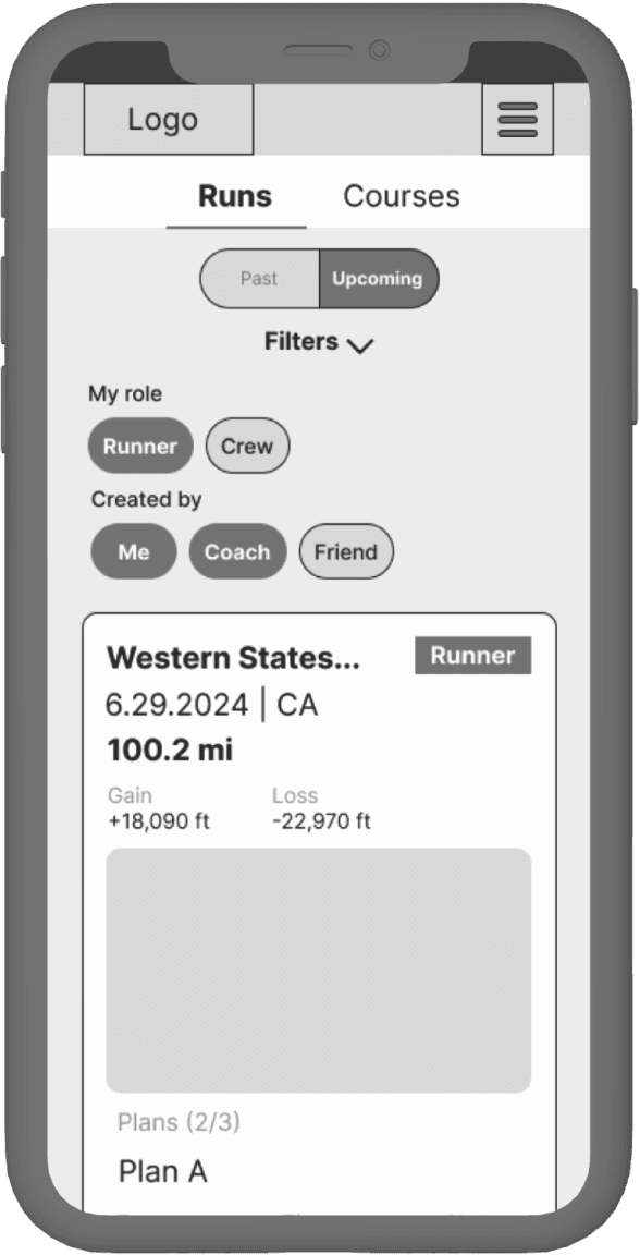
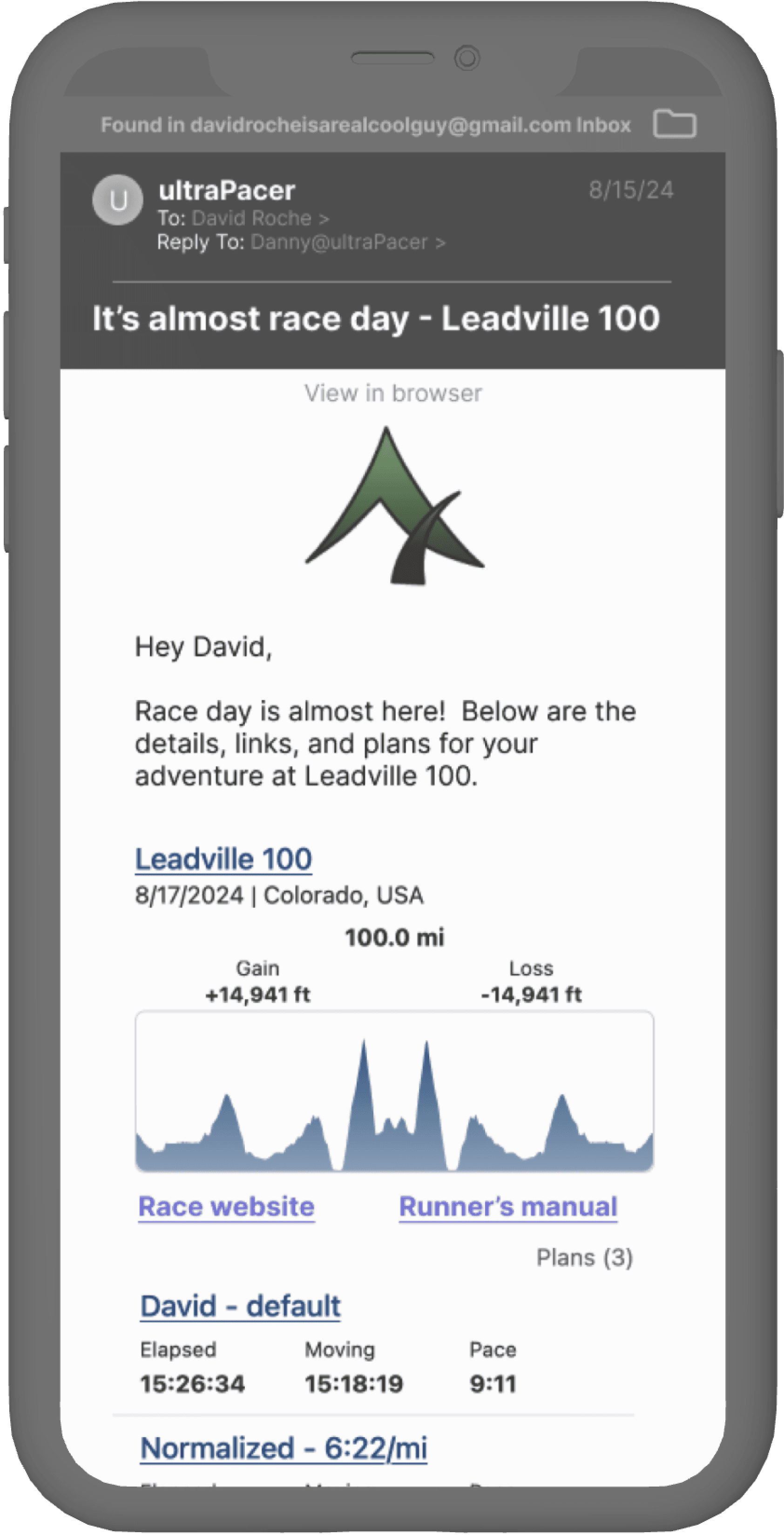
ultraPacer Pre-race Email
Getting everyone on the same sole page
Client: ultraPacer
Role: Product Designer | Content Designer
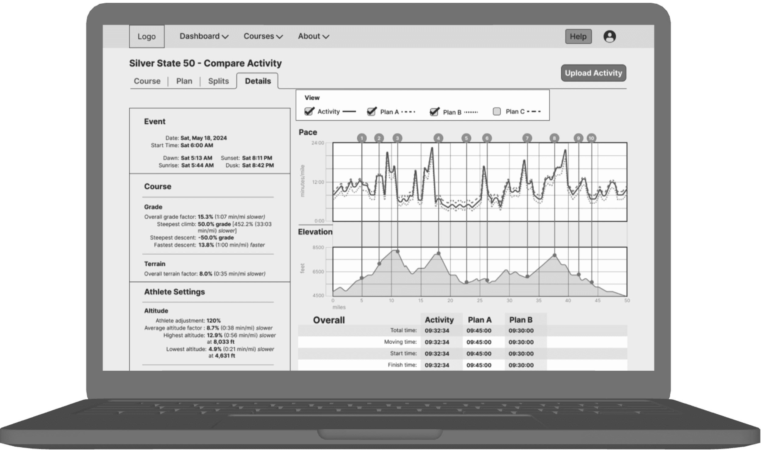
ultraPacer Compare Activity
Performance vs. the script
Client: ultraPacer
Role: Product Designer | Content Designer
Framewrk Launch Project
Challenges
Deliver designs based on PRDs to aid in soft launch of product
Audit the product for usability and accessibility issues
Improve user engagement by updating the onboarding process on the web platform
5-Week Sprint
UX Team
5 Generalists
My Roles
UX Researcher, Lead Content Designer, Information Architect, Product Designer
My Impact
created two personas that redefined product direction
boosted impact of product features by reorganizing information hierarchy
designed novel feature for launch
made content digestible for users
audited designs to eliminate WCAG violations
Tools
Figma, Optimal Workshop, Zoom, Slack, ChatGPT
Framewrk provides founders with spaces to connect to fellow founders and tools to grow their businesses. Their mission is to help a million businesses reach $1 million in net profit. Their product is spread across a desktop web platform and a native mobile app.
Scope of Work
My UX team got involved as the product was getting rolled out. Our goals were to improve the completion rate of the onboarding process - which is critical to matching users with peers in a pillar feature of the platform - and to improve user engagement with more features on the platform. We conducted stakeholder interviews three weeks before the soft launch and about six weeks before the real release date.
To assist with the soft launch, we created early designs for onboarding on the web and one feature - the Operations Diagnostic - to round out their minimum viable product. After handoff, we did user research to better understand Framewrk’s customer base and iterate on our designs.
First Iteration
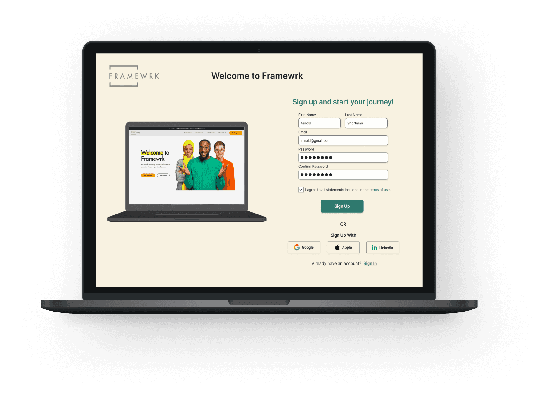
Due to the time constraints, we chose to conduct competitive analyses and a heuristic evaluation of the existing screens to inform our design choices. We had to maintain visual consistency with the rest of the product, but we were able to make some notable improvements.
UI Best Practices - Signup
1. The redesigned back button was placed next to the continue button for ease of use and visual consistency.
2. The skip button was removed from the intake screens to ensure the user would complete all questions.
3. We made it clear which questions and fields are required.
The answers to the demographic question were oddly-worded, which drew our attention - we suspected they would catch users’ eyes as well. Framewrk uses this info to sort users into affinity groups, but this is a sensitive subject for a lot of users so they were rewritten to be as standard and familiar as possible.
The progress bar was moved to a more conventional spot above the page title.
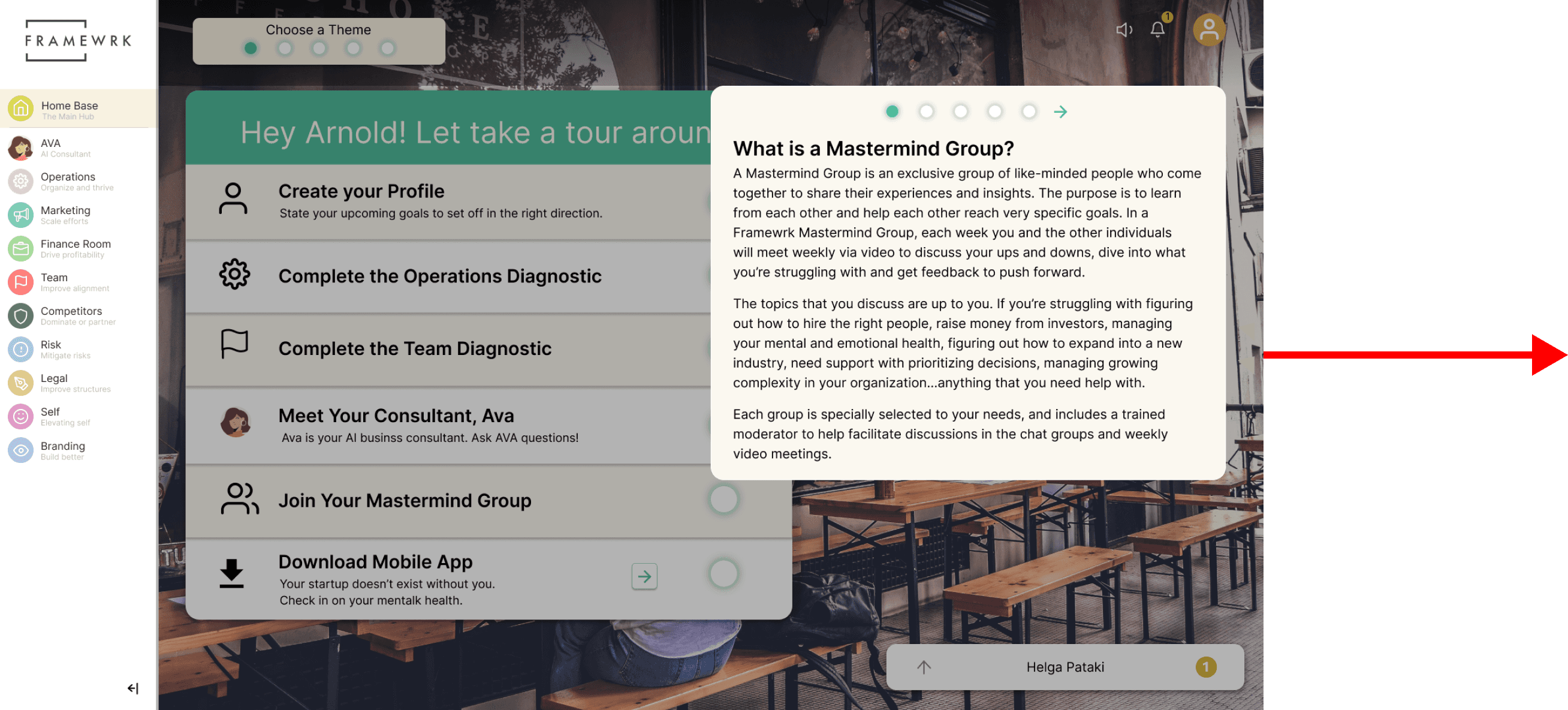
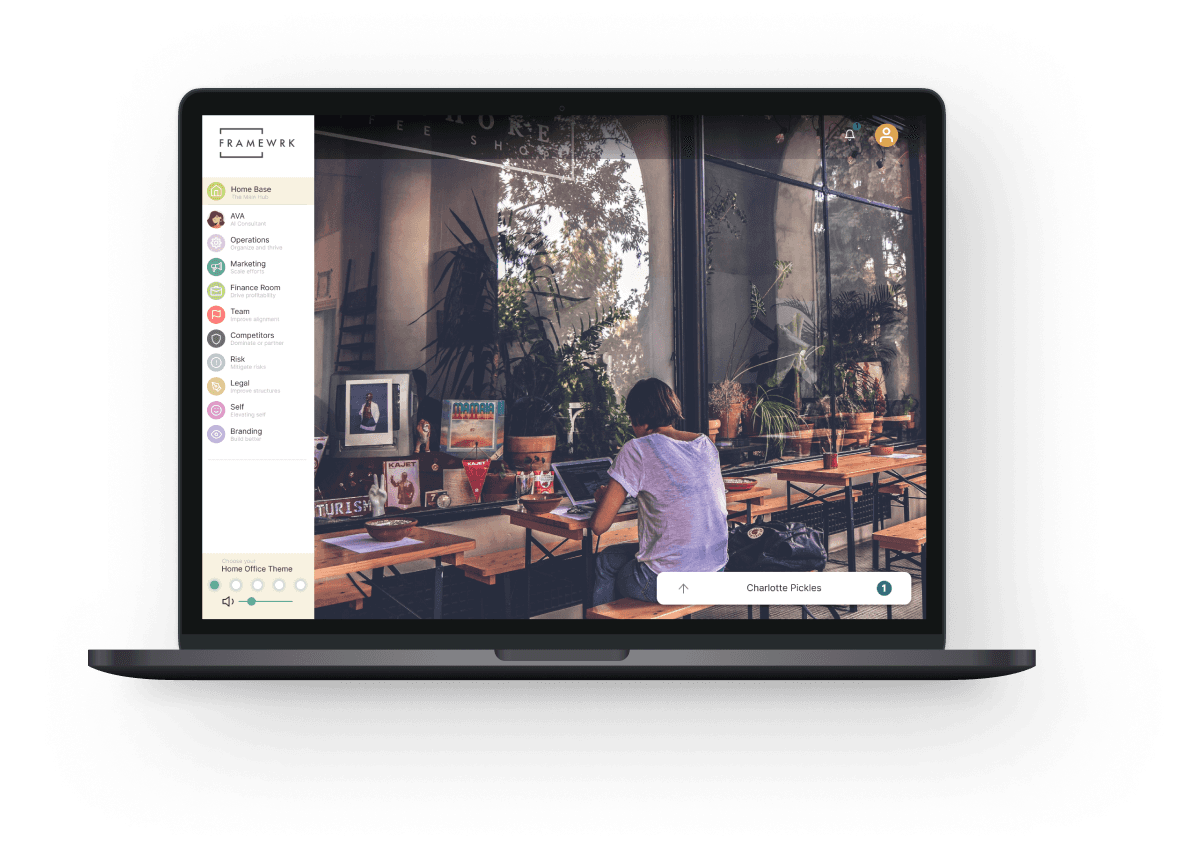
Framewrk’s approach to onboarding was a checklist of tasks with lengthy explanations that ate up a lot of space on the user’s dashboard. Inspired by competitive research, we opted for a tour of the platform hosted by the AI consultant, Ava. This tour explained the benefits of the features and showed where to find those features whle also restoring users’ freedom to engage with the platform as they choose.
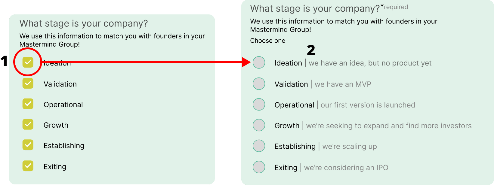
I added more clarity to this next screen by
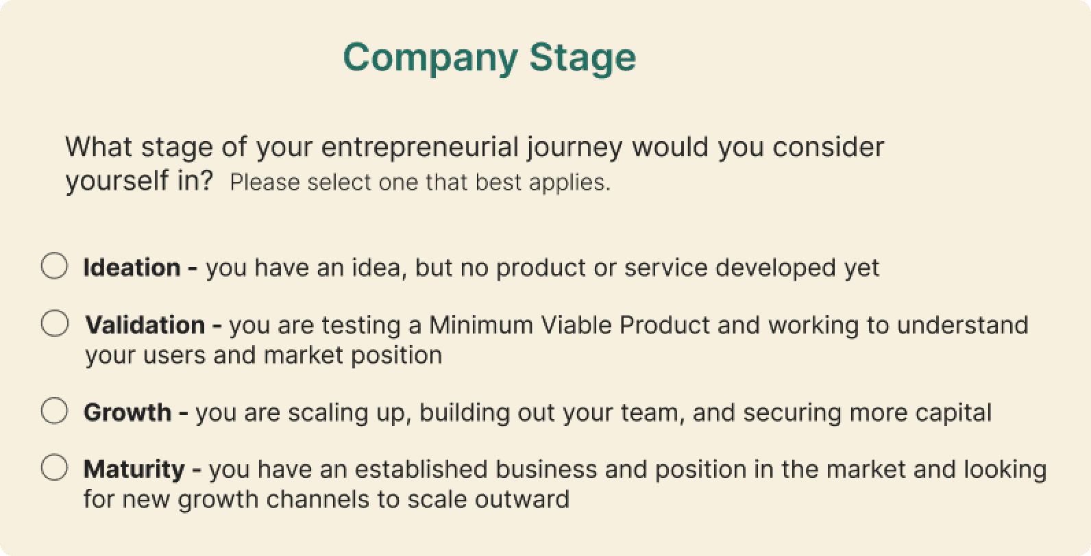
changing the checkboxes to circles, indicating that only one option can be selected
adding definitions to each answer for greener entrepreneurs
And we did some simple cleanup, like sizing the input fields appropriately
User Research
With these designs turned in, we met some real users. We conducted 6 interviews:
In our stakeholder interviews, we learned two things that helped us contextualize this data:
Framewrk defines its two main users are first-time founders and serial entrepreneurs
in initial tests, users that Framewrk had deemed “early stage founders” felt that the platform was geared towards even greener entrepreneurs
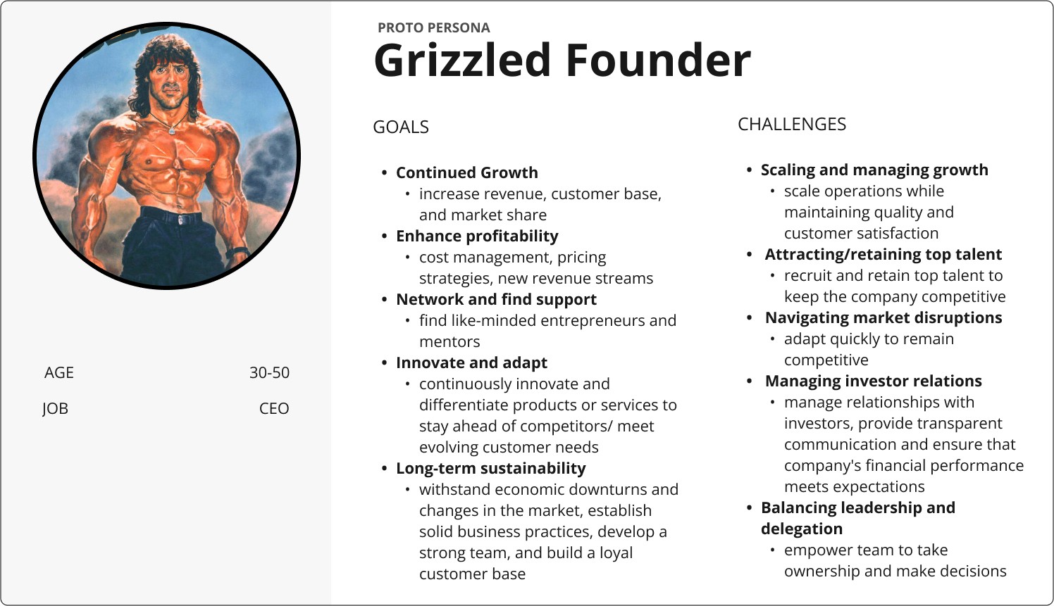
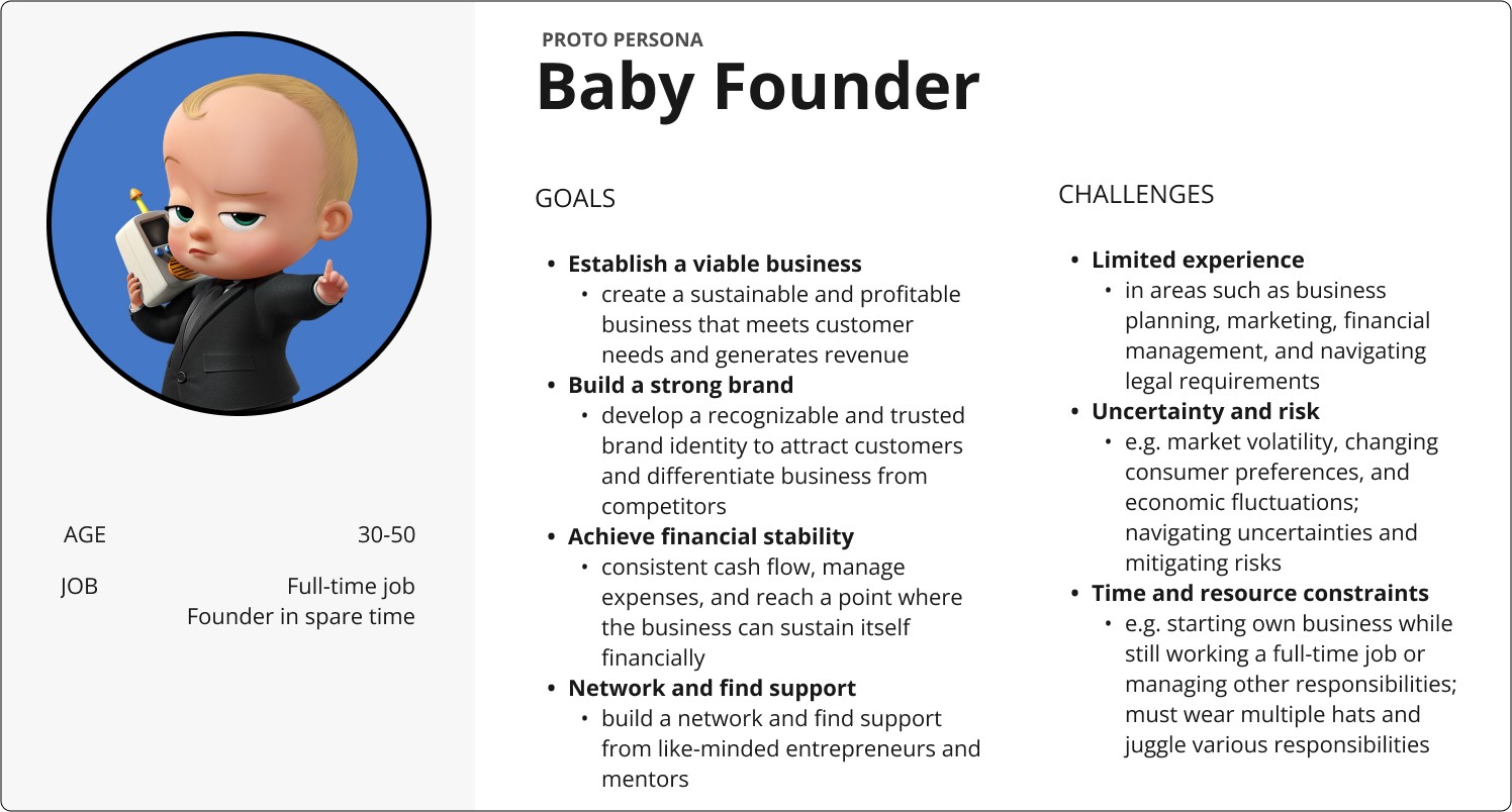
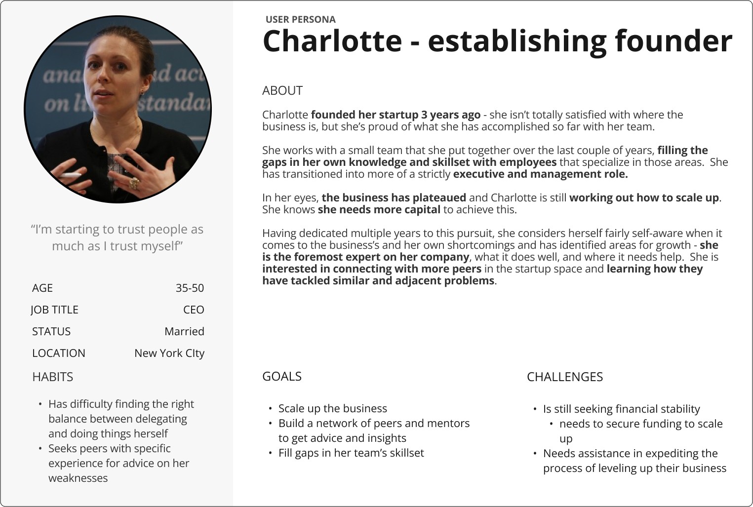
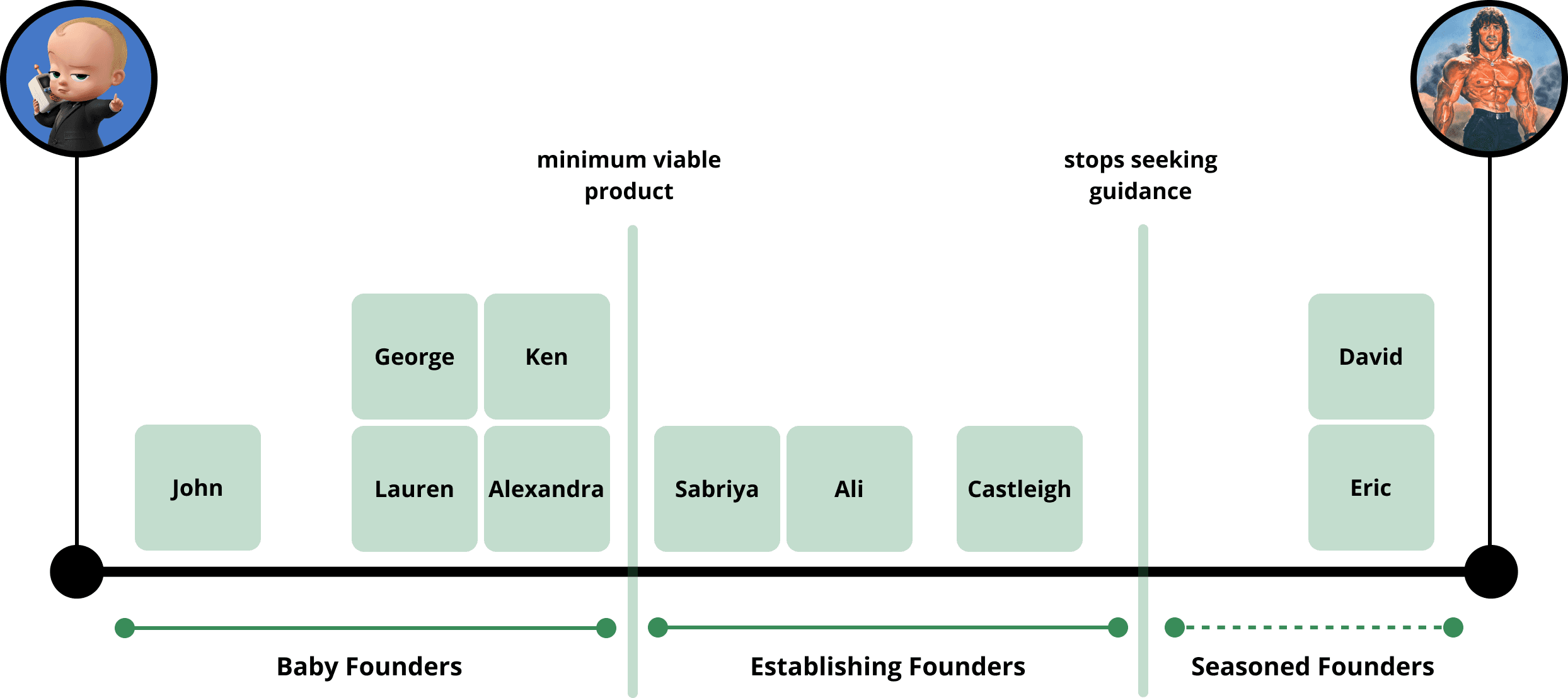
Our data didn’t lead to any conclusive insights at first because our users’ entrepreneurial experience ranged from very beginners to very seasoned. Using ChatGPT, I created proto personas for the core users Framewrk had identified - the first-time founder and the serial entrepreneur - and we used them to create an experience spectrum for our users.
The two core users were represented by two clusters - the baby founder (5 users) and the establishing founder (3 users + insights from 2 seasoned founders). The distinguishing factor was reaching one milestone - launching a minimum viable product.
The entrepreneur I had interviewed was at the far end of the spectrum and saw no personal need for most of the features on the platform. One other user was in the same camp - they weren’t seeking guidance, but were still interested in mentoring other entrepreneurs. We set this cluster aside as a possible future third user.
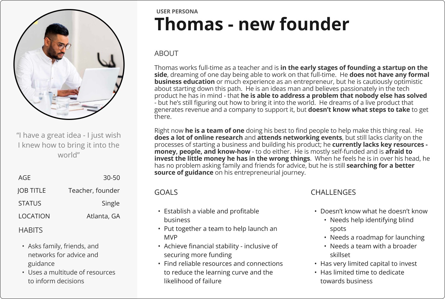
User Personas
We combined this with data from four of Framewrk’s own usability tests. In total, we used data from 10 users.
4 prospective users provided by Framewrk
2 entrepreneurs that we sourced
Revised Scope of Work
Tommy and Charlotte have very different priorities and needs so the one-size-fits-all approach to user engagement would jeopardize user retention. After presenting this information to our main stakeholder, we got his blessing to refocus on onboarding funnels to point our personas to relevant features.
With the launch quickly approaching, I proposed that we create two versions of these funnels -
one built on top of the existing design to implement with lower technical debt, and
one built on a redesign of the platform with an improved information architecture and more curated content
Second Iterations
We focused on three things as we worked on the next iteration -
collecting the necessary information for peer group matching
getting rid of jargon that was unfamiliar to Tommy
addressing concerns about how demographic information is used
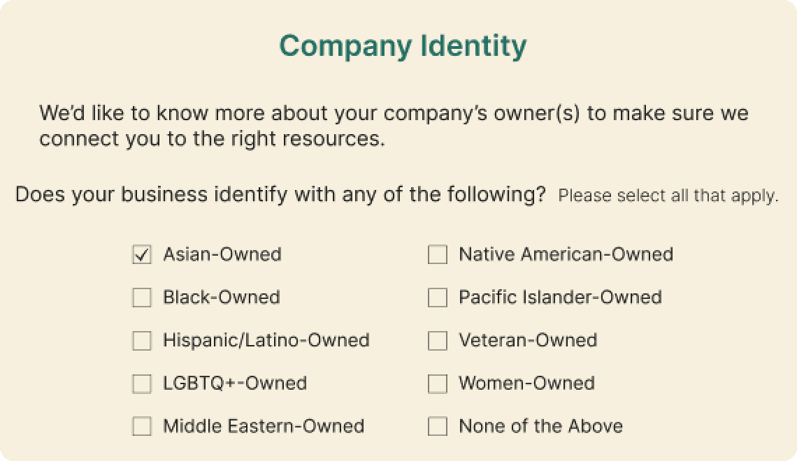
Framewrk’s user base has not yet hit critical mass, so it is not able to effectively match users with industry peers at similar stages. To plug this hole, placeholder groups are formed using secondary factors like age and race during onboarding, so it’s critical that users provide that information. In early testing, 3/6 users were uncomfortable with and unsure how this information would be used.
The focus of the platform is growing businesses, so we used a question about the identity of the business in place of the race of the user and explained why we were asking.
In our research, we found a lot of different terms and definitions for company stages. Both users had trouble answering accurately - Tommy didn’t understand his choices and Charlotte felt that multiple options applied to her. We whittled down the list to four simpler options.
This question is where the users are funneled into their respective onboarding experiences. Tommies are identified by selecting “Ideation.” Charlottes might choose any of the other three options, but they at least have a minimum viable product and a company that is generating some kind of revenue.


Tommy is introduced first to the features that would create a roadmap for him -
the business diagnostics
Ava the AI consultant
With some structure in place from the roadmap features, he would better be able to engage with the community in -
the curated peer groups and
the discussion forums
Charlotte was attracted to Framewrk by the community features, so that’s what she sees first -
the curated peer groups
the discussion forums
This allows her to seek information in a way that she is more familiar with
She is then shown
the AI consultant, which bridges the gap to the
diagnostics (something we understand she is less likely to use)
Both users are encouraged to set up their profiles at the start of their tours - this helps improve the peer matches in the curated peer group.
A New Framewrk - Redesigning the Platform
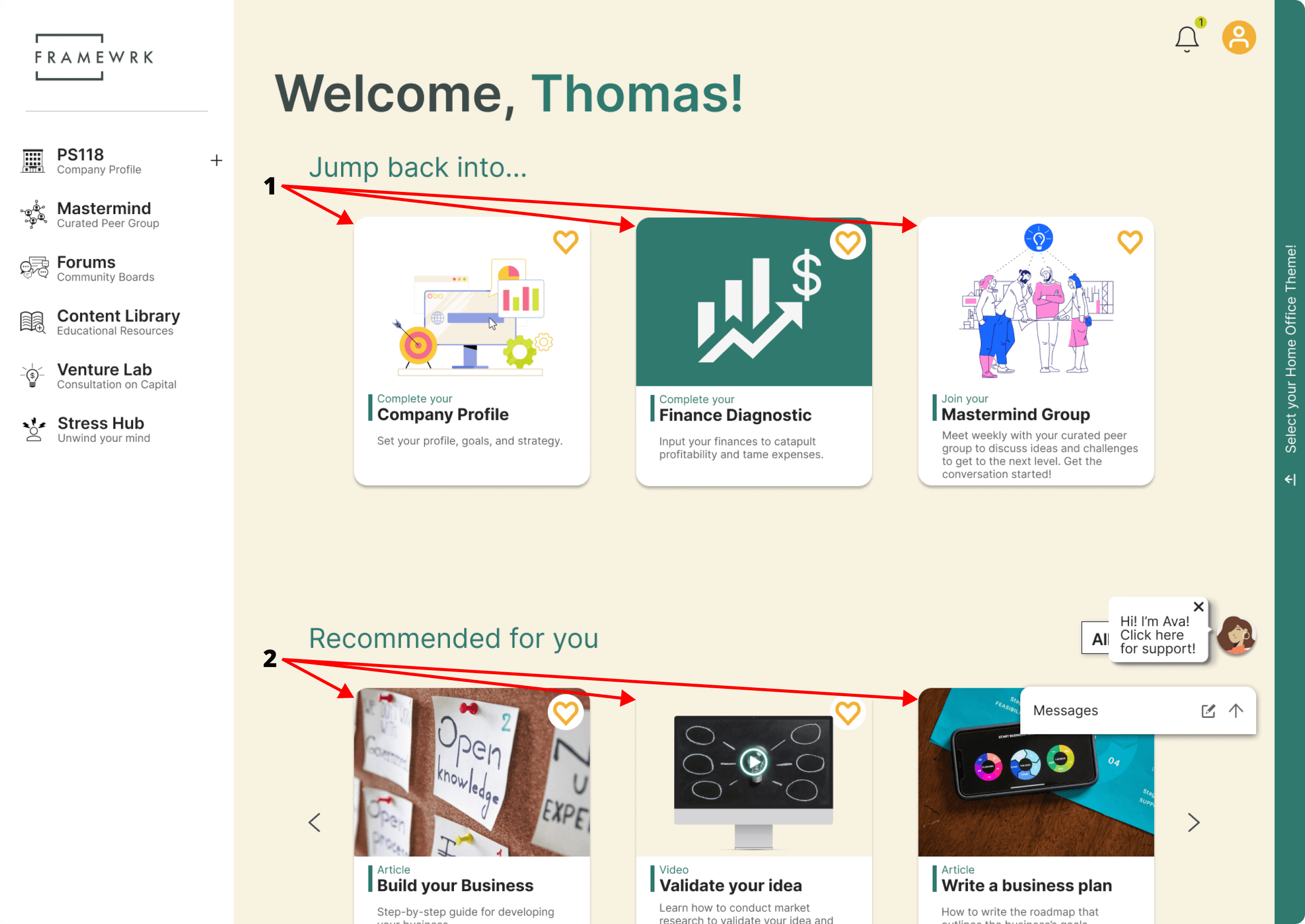
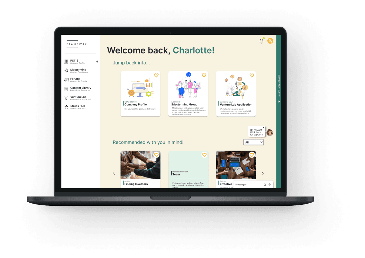
Framewrk aims to provide a curated experience for its users, so we leaned into that in the redesign. We turned the home page of the platform into a dashboard that
encourages the user to complete things (like sections of the profile and diagnostics) that they had previously abandoned, and
recommends content and features to users based on their needs, interests, and engagement
This helps Framewrk achieve their goal of greater user engagement across the platform - and testing the efficacy of their product - while focusing on users’ individual needs and interests.
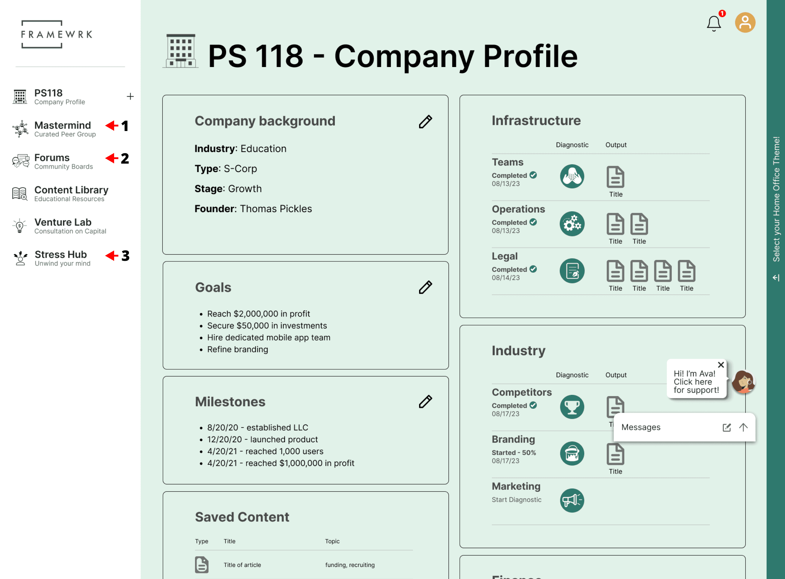
The company profile got a major face lift. If the goals and milestones that Tommy adds here are important landmarks on the entrepreneurial journey, then outputs from the diagnostics and Ava’s consultations form the roadmap that Tommy needs. These are now collected and organized in one place so that Tommy can connect all of these pieces and see a path to progress.
A clearer hierarchy emerged when the diagnostics moved under the company profile umbrella. Features that had been an important draw to users became more visible and prominent, such as the key pieces of the community -
curated peer groups
and
discussion forums
In our interviews, users had noted that mental health and stress were common concerns. Early beta testers had liked that Framewrk had features to address stress, but they were buried within a diagnostic that Charlotte probably wouldn’t use, so we pulled that out and added it to the left side nav as well (3).
A New Framewrk - A New Look
As we put together this redesign, we discovered some accessibility issues with the current color palette. There was not enough contrast between colors of backgrounds, text, and UI elements. We recommended creating a new palette altogether with this in mind, which probably necessitates a larger rebrand for the company.
Check out the prototypes
The icons were unconventional, sometimes using images that were commonly used for other purposes - for example, a single gear is a pretty universal icon for “settings” but it was used for the Operations Diagnostic. We redesigned the icons so that they would be more recognizable to the user.
In our designs, we replaced one of their primary colors - a teal green - with a darker variant, which passed the contrast checks when used in UI elements.
Next steps
Testing and Feature Prioritization
Our redesign is still untested and we don’t have solid metrics to compare user performance and preference, so our clear first step is to test both versions of the platform to establish a baseline and compare. Because a lot of the features of the platform are still being built, now is the time to start figuring out how success of the product is defined. The two personas we have defined so far differ radically in their needs and wants, so their engagement needs to be measured accordingly.
New Users
Updating the existing website with a focus on SEO will help new Tommies and Charlottes find and preview the product that has been built with them in mind (so far). Framewrk’s current strategy for adding new users to the platform depends on features that aren’t completely built and users that are not represented by either of the existing personas. There are two implied personas that need to be defined - the mentors and the non-founder team members - and after they are better understood, new corners of the platform can be fleshed out to accommodate them.
Language
Beyond SEO, the website could better explain the features of the platform to prospective users. Tree testing would help with renaming features and a chalk test would be useful in determining the general efficacy of the redesign, allowing for shorter, more specific task-based user tests in the future that don’t burn out the users.
Reflections
This project was pretty eye-opening for all involved. While the design work we did may not have resulted in the flashiest visuals, it was a great reminder of the impact of prosaic experiences and the pre-design work that goes into them. The questions raised while putting together the on-boarding experience sent ripples throughout the product. I think it’s fair to say that our greatest contributions were the personas we created. By showing Framewrk their product through the lenses of their users, they were better able to understand the value of the different features they’re rolling out and re-prioritize the work they’re doing as they launch.
My other big takeaway from this project was the immense gratitude I had for our working relationship with our main stakeholder - Framewrk’s founder and CEO, David. He came to the table with an open mind and a genuine interest in what we were learning about his users and how we were applying it to his product. The initial scope of work was a lot larger on paper than what we ultimately delivered, but I think what we delivered helped re-frame and refocus the product for David and his internal team - what it should do, what it can be, the multitude of experiences it can provide, and how different people want to use it. We could not have been luckier to have worked with a client like him, and I’m really proud of the work we were able to do together. May all UX designers be so fortunate as to work with a David.
Onboarding on the existing platform
Onboarding on the redesigned platform








Drop me a line
stevenmcastner@gmail.com