
TurboTax is the prevailing leader in the e-filing space, but most people don’t know that their lobbyists are responsible for keeping the IRS from creating a proprietary tax filing platform that is free to all and widely used. That is, until now. Our team was tapped to help create an alternative to the dark-pattern-riddled “free” version of TurboTax.
The team was tasked with improving the usability of the IRS’s responsive site and the tax filing experience for users with simple tax returns -defined as someone with standard deductions and a W-2 income less than $73,000 (filing form 1040 only). To better understand the problem, we conducted 8 user interviews, bolstering our findings with a competitive analysis and Heuristic evaluation.
The IRS seemingly needs no introduction. Every Spring, American taxpayers file their taxes, and as of 2019, 40% of those returns were already getting filed electronically.

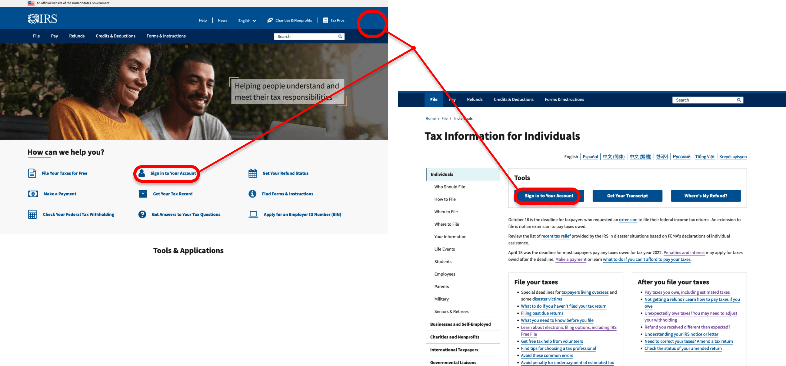
In initial user interviews, users told us that the IRS site was hard to navigate -
it didn’t follow conventional UI patterns,
most pages contained an overwhelming amount of text and content,
it was unclear what content was relevant to the users
because of the organization and jargon-heavy copy.
In observing users on the site, it was clear that the website did not emphasize very clear user flows - the visual hierarchy needed work and it seemed that the website was not constructed with our target audience in mind.
We the People
Initial User Research
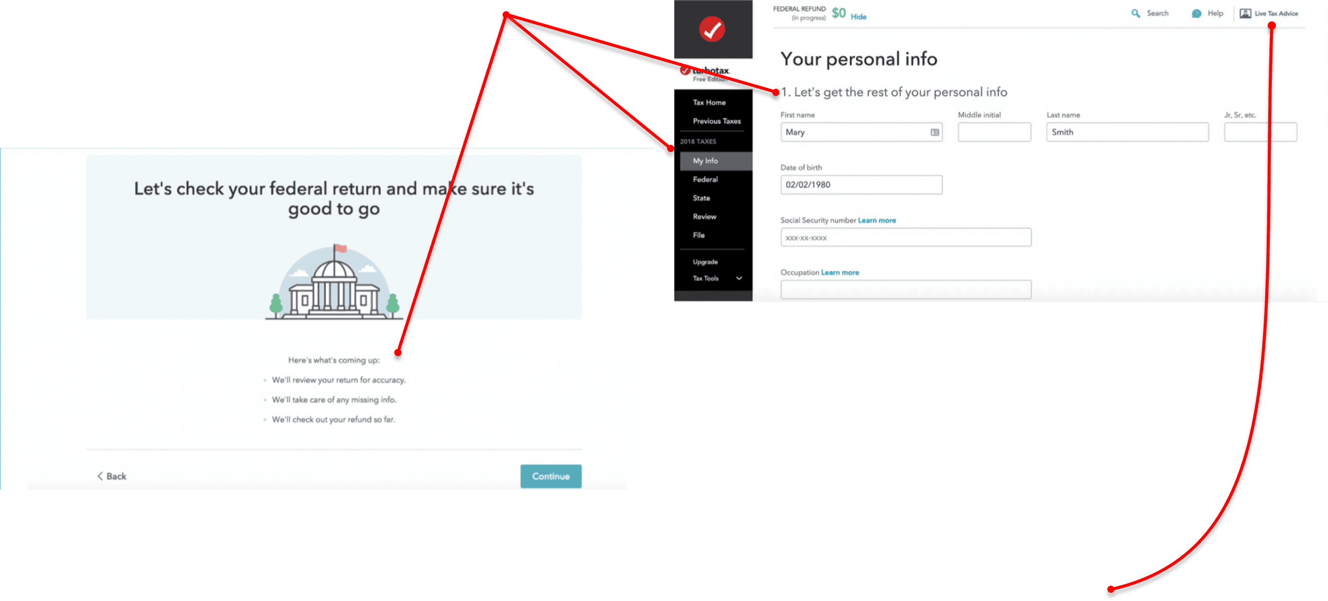
Our team discovered that 5/8 users with simple tax returns had used TurboTax to prepare and file - users noted that TurboTax had strong brand recognition and that the platform was straightforward and easy to use.
It walked users through the process step by step
with simple language
and a sleek, clean aesthetic.
Generally speaking, users had positive things to say regarding the UX of TurboTax’s platform.
“Imposing Taxes on us without consent”
One user was frustrated to find that she had to pay to file once she finished her return. She believed she was using the free version of the service, and according to our research, this is an all-too-common issue - TurboTax’s help and support features (allowing users to check their work before submitting) funnel unwitting users into the paid version without announcing the change.
These insights pointed to several core design principles
transparency
simpler and more accessible copy
improved visual hierarchy
more intuitive information architecture and UI patterns
in-platform support that can answer common user questions
Our interviews pointed to one common use of the site that we would need to design for - checking one’s refund status. We now had two focuses for our site redesign:
a new tax filing platform housed on the IRS site
an improved tax refund tracker
We hold these truths to be evident
Research Insights
The People form a perfect union
User Persona
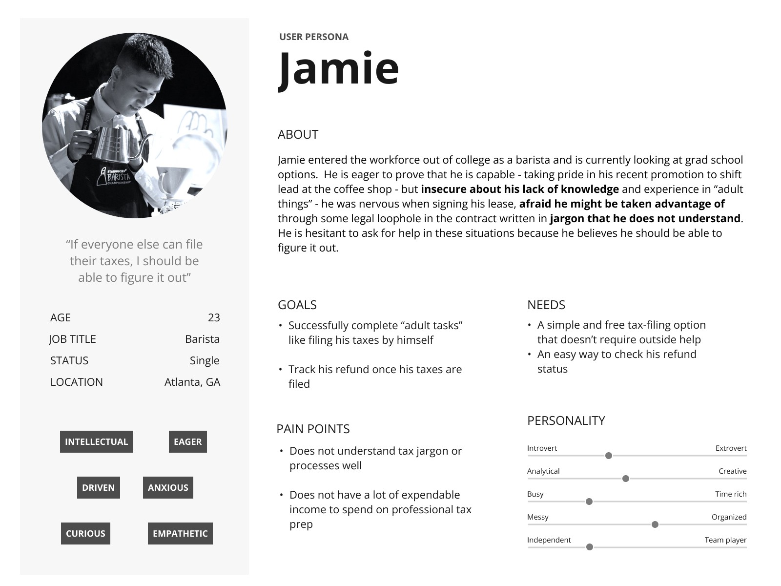
Jamie is a busy working adult who needs a streamlined and intuitive platform to efficiently file taxes with simple step-by-step instructions so that he can get accurate information for tax filing and easily monitor his refund status.
Unfortunately, the existing IRS website presents significant challenges in terms of navigation and unclear instructions that overwhelm users. Consequently, users experience frustration and are prone to making mistakes during the tax filing process.
Jamie’s problem
How might we -
create a quick and easy way for Jamie to check his refund status?
simplify the tax filing process on the IRS website for Jamie?
provide support for Jamie as he is filing his taxes?
The Constitution
A Declaration of Independence
Preamble
Information Architecture
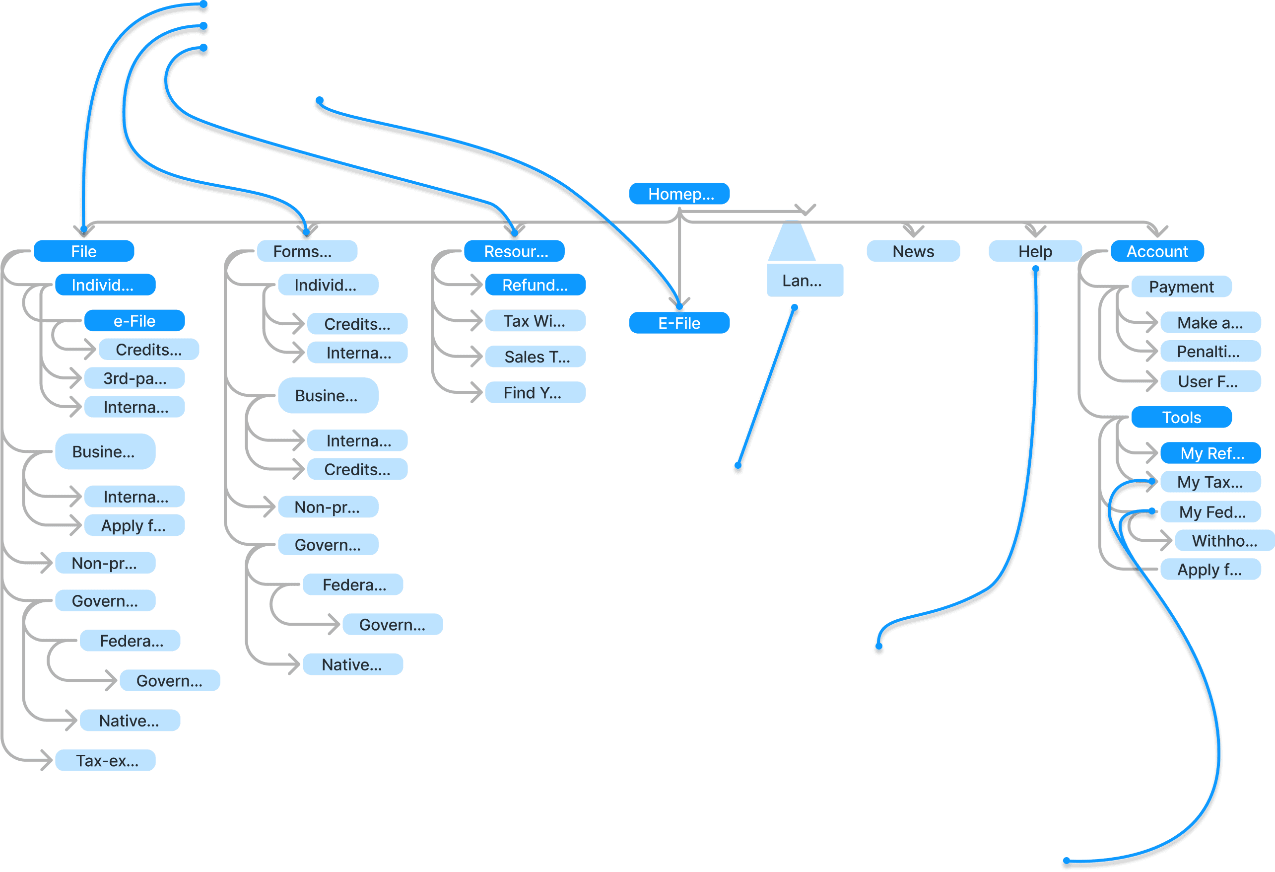
My goal in putting together the first sitemap was to streamline Jamie’s primary tasks and make the search bar unnecessary - everything on the current site still needed a home, but one that was easier for Jamie to find.
The main nav bar was condensed to three drop-down menus -
File (for users to start their returns),
Forms and Instructions (for users to find individual and miscellaneous forms) and
Resources (for tools such as the refund tracker and withholding estimator).
I added a link to file through the IRS on the homepage so that he would see it when he first arrived on the site.
The existing site has a second tier nav bar as well. We loved the language option - according to the US Census Bureau, at least 68 million people speak a language other than English at home, making this an important accessibility concern - so we retained that in the redesign.
Because our plan to compete with TurboTax hinged on creating a personal account - allowing users to save their progress and pick up where they left off, pull tax data from previous returns, access personalized versions of tools through the account page, etc - I added the account page link in the second nav bar, following nearly universal UI conventions for upper-right corner placement.
We were unsure whether or not the current “e-File” name made sense to users - or if there was enough name recognition that changing it would be confusing - so I challenged users to make sense of it in our tree test.
The existing site also had a help page linked there, and as we had not yet designed an alternative, that was also retained. The team decided that the news link should stay because it may contain relevant deadlines and updates - given the focus of the redesign and the length of the sprint, I did not have time to collect user feedback on this but I would like to revisit it in future iterations.

“Just call it ‘File Tax” - no need to get fancy with names”
“I think just ‘File’ would make more sense to me”
“eFile makes sense to me but it makes me wonder what ‘File’ is for - is it for the documents needed to file your taxes because there was an option for forms”
“It does make sense, maybe only have File or eFile”
They didn’t love it.
In Task 2, users were asked to show us where they would check their refund status.
Users struggled to complete this second task. They made two suggestions in the feedback - make the refund tracker directly accessible and add it to the account page. These suggestions aligned with our design principles.
**In retrospect, I think it would have been more effective to create a barebones lo-fi grayscale wireframe to test these tasks. The e-File link seemed to get lost in translation in the tree test, which slightly affected our results and how we interpreted them. We still received useful feedback, but our users would have understood the setup enough to focus more exclusively on the task and the naming that we were testing if they had a better sense of what is a category/menu and what is a link.
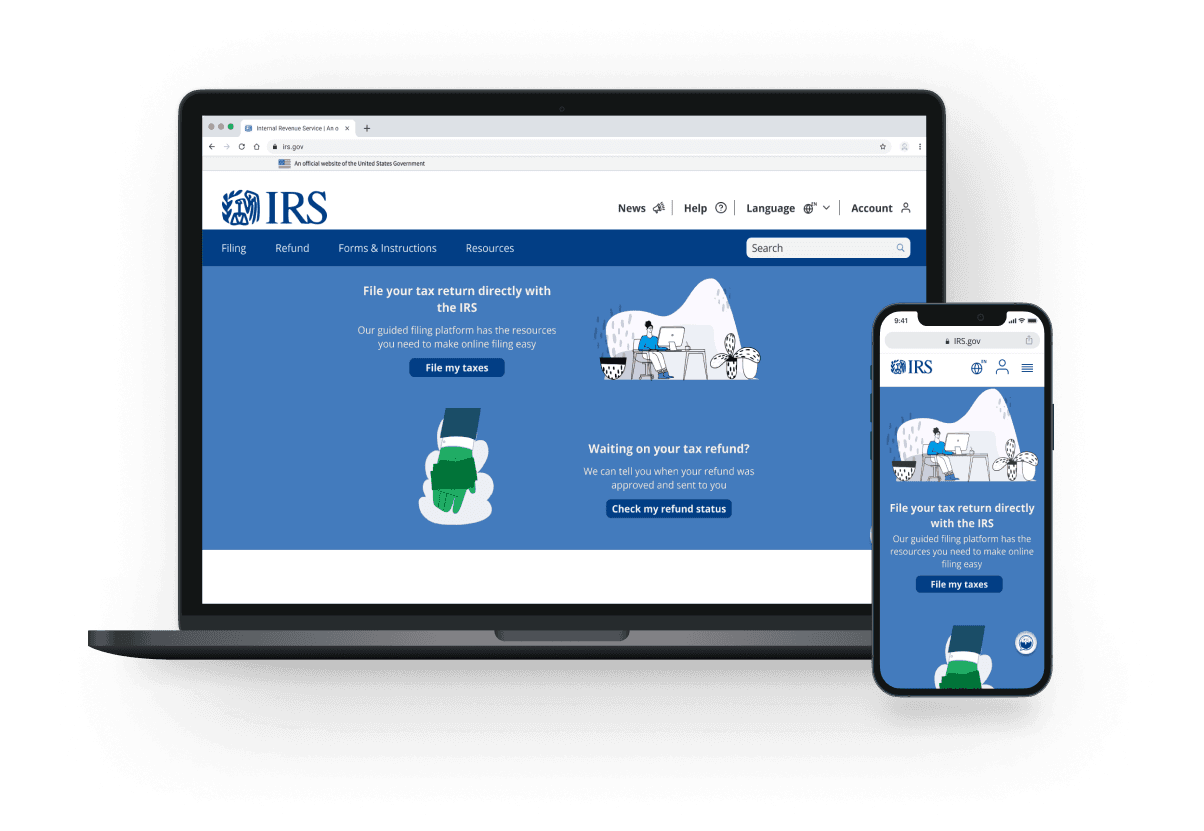
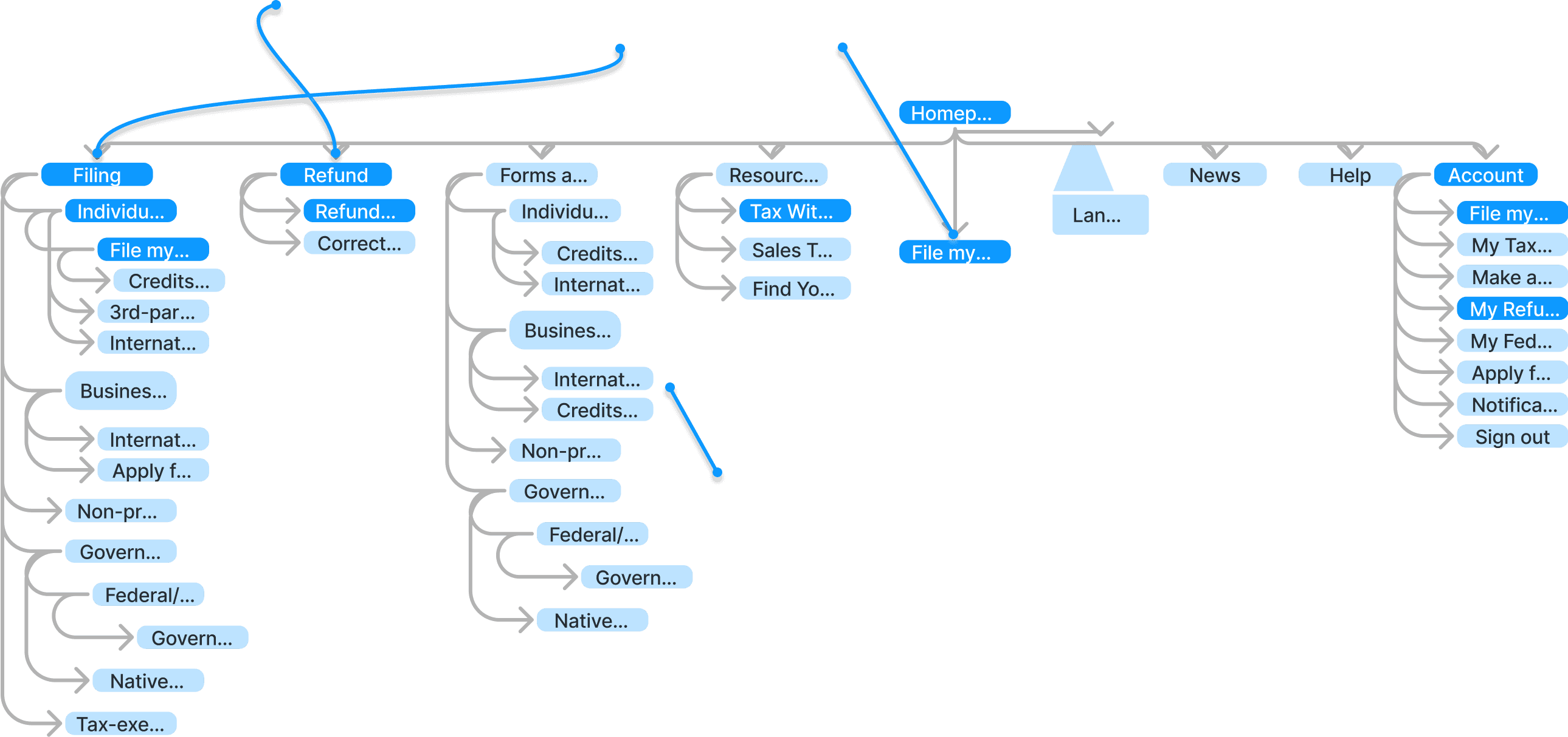
After revising based on tree test results, I landed on a nav bar with
an additional Refund drop-down
updated microcopy for the Filing drop-down and “File my taxes” button on the homepage
It was clear that the top-level navigation we’d imagined would not translate well to mobile windows.
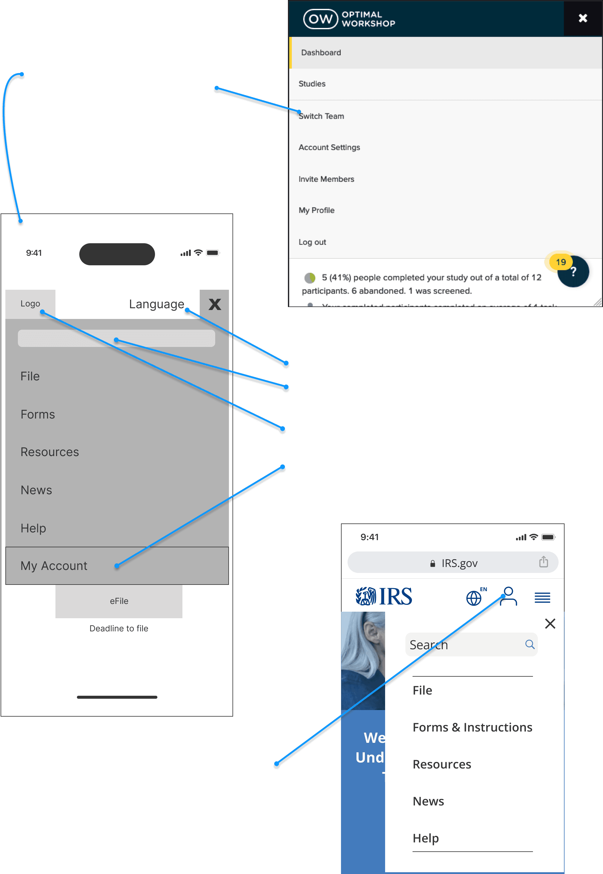
After looking at a number of responsive sites with relatively similar desktop nav bars, I brought a wireframe option to the group that was heavily influenced by Optimal Workshop’s design.
Article One
Ideation
With this basic page layout in place, we divvied up the designs of the necessary screens for Jamie to start filing his taxes and to check his refund status between the five group members.
There were two exceptions -
the language option stayed outside of that menu for easy access and because of the function of the drop-down list
the search bar moved to the top of the drop-down menu per mobile UI conventions.
The IRS logo would stay in its upper left corner location, per UI standards, as a link back to the homepage.
The account page link was still in a prominent spot as the bookend of the list.
I rearranged the left-to-right nav options from top to bottom in a hamburger menu accessed in the upper right corner. This directional approach became a key design strategy when translating the mobile designs to desktop dimensions.
As a group, we decided to pull the account page link out of that menu and place it next to the hamburger menu so that it would be more directly accessible to users.
I took on the screens in the tax-filing process.
I quickly decided that I was going to end the flow part-way through the filing process. My goal was to test the basic function of the input fields and moving between pages/sections of the filing process, but to ask a user to go through the entire filing process in a usability test would be a tough sell (and borderline abusive) and might lead to less depth in the user insights as the user got fatigued over the course of a longer test - not to mention the timeline for this sprint was too tight to effectively tackle the entirety of the filing process.
We had discussed that Jamie’s easiest W-2 option would be taking and uploading a picture from his phone because he might not have access to a scanner. The flow was ended at the beginning of the next section, Income, where he’d be prompted to input W-2 information.
The input fields and section breakdowns were relatively similar amongst our competitors, so I took my cues from those examples -
stick to a manageable number of questions per page
(five, although some may have been broken up across a few input fields)
and write simple, concise, and direct copy
Although not the most beautiful layout on desktop, I kept questions and input fields mostly left-aligned for easy scanning and clarity - trying to make the process enjoyable seemed like a stretch, so I focused on getting users through it as quickly and efficiently as possible.
Article Two
A Tax-Filing Platform is Born
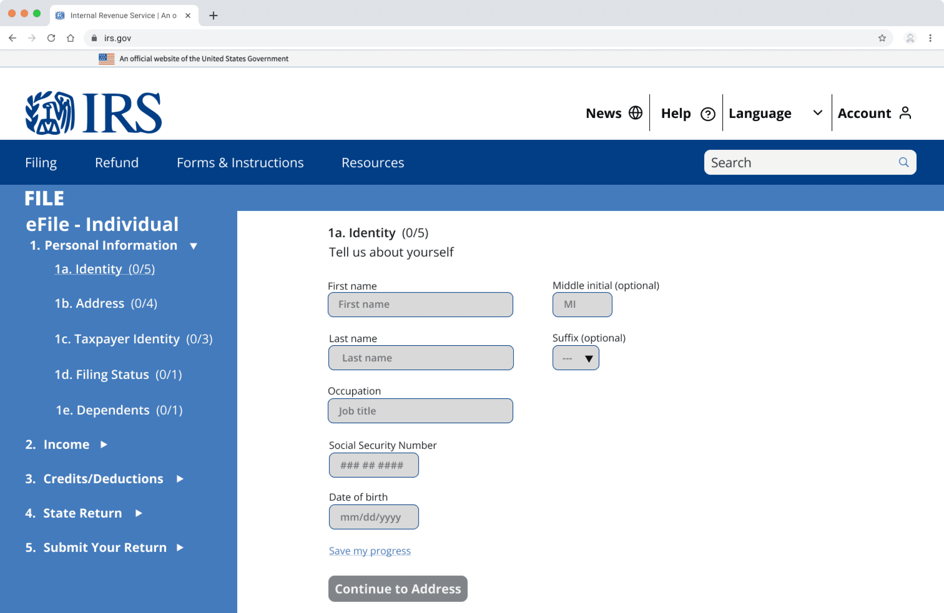
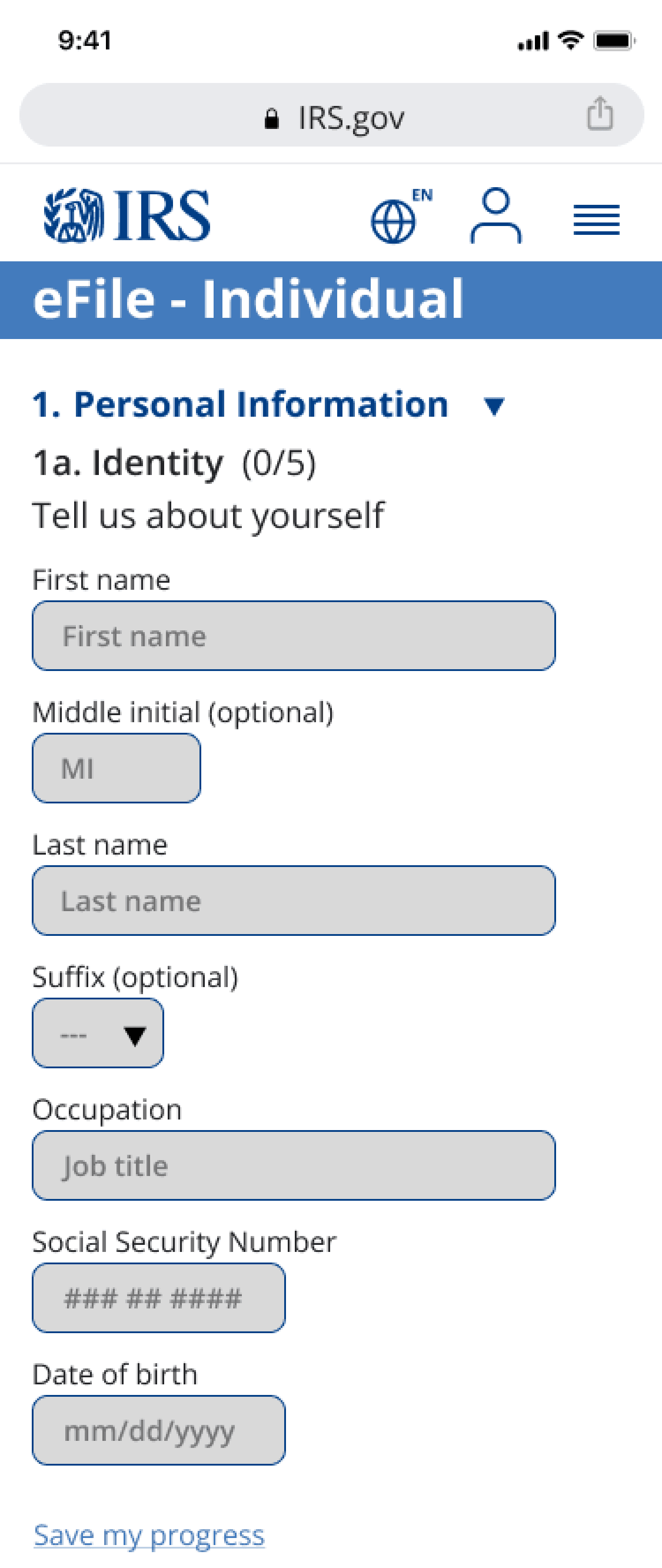
In our first round of testing, we recruited five users to test the desktop version of the tax filing platform and the mobile version of the refund tracker.
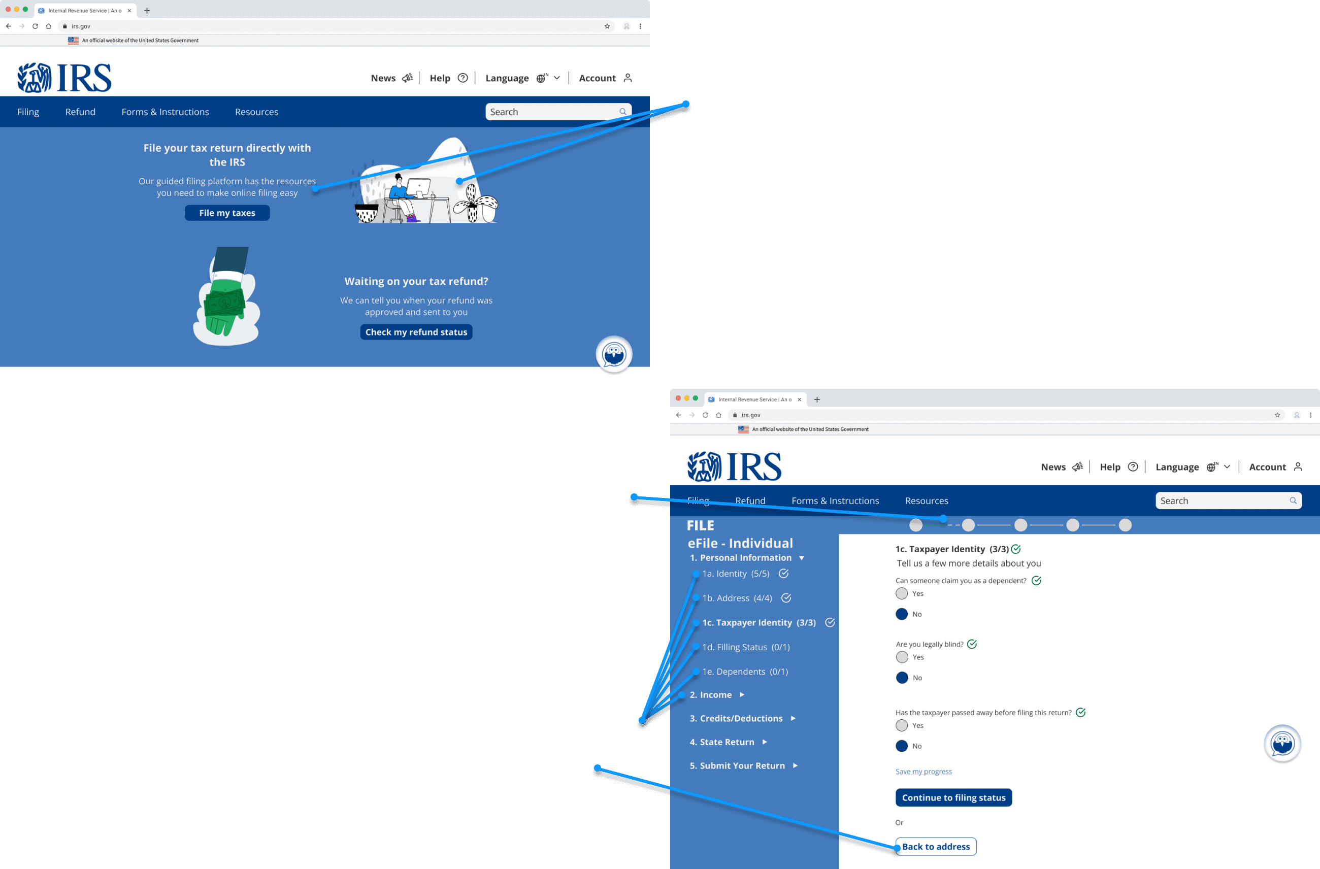
Users were asked to give a first impression of the home page on desktop before beginning the first task - begin their tax return on the IRS site. There were two avenues available - using the “File my taxes” button on the homepage, and the Individual option on the “File” page.
After concluding that task, users switched to the mobile prototype and were asked to check their tax refund status.
Ratified
5/5 users were able to successfully complete both tasks; however, there were a number of things they told us could be improved:
it was harder for users to check their refund status than we had hoped
the refund tracker we designed was hard to understand and didn’t contain the refund amount
users assumed they could freely navigate the steps in the filing process but were missing some of the navigation options to do so
they also wanted a more visual way to track progress through the tax filing process - an actual progress bar rather than simply the number of questions completed on each page
and confirmation pages throughout the tax filing process when they were finished with a section
Users also suggested more personable copy to entice use of site features. Illustrations were added to tone down the sterile and intimidating government feel and put users at ease - this had worked to great effect in the TurboTax platform.
4/5 users used the “File Tax” button on the homepage rather than navigating the Filing drop-down - this was a good indication that users might be similarly successful with the refund tracker if we promoted it with a link on the homepage.
The First Amendments
Usability Tests - First Iteration
The Second Amendments
Usability Tests - Second Iteration
Check out the prototypes
Moving Forward
This was a great learning experience on the whole and has revealed a few new steps in my process for future redesign projects:
Assess the prioritized flows on the existing site
investigate them in initial user interviews/research to help inform design decisions
create a checklist of all insights and design principles to refer to when sketching, wireframing, and writing usability test scripts
conduct A/B tests of the existing site and the prototype where applicable to more clearly measure improvements
Next Steps
Short-term
Add microcopy to Johnny the helpbot so that users can identify his function
Design an in-page solution to explain tax terms in the filing platform to help users confidently fill out tax forms
Design confirmation/progress pages for milestones in the tax-filing process
Create and test a flow/scenario for the “save my progress” function to get a more complete user impression of the current design
A/B test existing site and current prototype on the flow for checking refund status to measure improvement
Finish the Filing page for Individuals and the filing progress indicator within the platform
Middle-term
Build out remaining basic pages of tax filing flow and test them
A/B test current and streamlined flow for signing into account when starting to file - test an alternate flow that directs user from sign-in page to the beginning of the tax forms rather than the account page
Long-term
Research tax forms and reassess their place in the sitemap
Build out tax filing platform design that accommodates complex tax returns
I had wondered about the user freedom piece of the filing pages as I was designing them - was it better to allow folks to fill out information in whatever order they chose, or was it better to lock them into a specific flow?
3/5 users tried to navigate by clicking on the side panel at some point in the test.
2 of those users also called out the lack of a back button on the filing pages.
We added both features to the second iteration.
Given time constraints, a placeholder progress bar was added to the filing pages. It wasn’t as polished as the rest of the page, but it was worth testing the efficacy of the design idea - the Personal Information section was broken down into five pieces, which I tried to represent in the progress bar.
2 users made note of the flow from choosing a filing option to signing into their account to choosing to file on the account page and finally into the filing pages. Because of the tight window, this was not addressed in this iteration, but it’s an important consideration for next steps.
I believe this was a break with conventions and would have liked to have taken the third step out of the flow, but there wasn’t a consensus within the group about the decision and it hadn’t affected users’ ability to complete the tasks so it was tabled.
Once again, we asked users to start filing on the IRS site on desktop and to check their refund status on mobile. Because of user success in the first round of testing, it was no surprise that 5/5 users were able to complete the tasks.
Ratified
A lot of our efforts paid off -
users unanimously commented positively about the illustrations
5/5 users found the refund tracker with ease
notably, 2 users used the refund drop-down menu rather than the button on the homepage - it may be worth moving the refund status button to the top of the hero image on the homepage to make it more visible to mobile users
Despite the success in task completion, there were still things to improve -
2 users said that the progress bar wasn’t visible enough
one user thought we needed confirmation pages throughout the filing process - a change we did not get around to due to time
the copy needed updating on the sign-in (explanation of ID.me) and account (current balance) pages
2 users wanted more help during the tax filing process
Johnny the helpbot’s function wasn’t clear - he needs to be labeled
there weren’t enough in-page resources to explain tax terms
according to one user, the save my progress button wasn’t visually emphasized enough
IRS Responsive Site Redesign
Challenge
Improve the tax filing experience on the IRS Responsive Site for users with simple tax returns
4-Week Sprint
UX Team
5 Generalists
Role
Principal Information Architect,
UX Content Designer, Generalist
My Impact
created and tree tested a new sitemap
audited designs to eliminate WCAG violations
designed digestible content for users
Tools
Figma, Optimal Workshop, Zoom, Slack
Reflections
Looking back on the key insights from our initial user interviews, I think the team did a great job of addressing the primary concerns of our users - especially in such a short sprint - but we left some of the details on the table. For example, our users were clear that they wanted a free platform for filing their taxes, but our copy made no mention of our platform being either a free or paid tool because we were primarily focused on the usability of the design.
This would be easily remedied by organizing design principles by priority and effort; a ranked list would have prescriptively guided our sketching, wireframing, and test scripting, and copy would have ranked higher on that list because of the high impact and relatively low effort to fix it.
In comparing our redesign to the existing site, it is clear that we deprioritized the payment flow because we were focused on Jamie’s needs and the users he represented had waited for a refund. But Jamie isn’t the only user. A more careful audit of the site at the start of the research phase would have pointed to a proto-persona who owes taxes.
With more time, I would love to have researched the individual forms and added those to a subpage for any relevant filing options under the Filing category, condensing the nav bar options again for Jamie and making those supplemental forms easier to find and more directly accessible for the user.
Despite the issue with the labels, all users were able to complete Task 1 - identify where they could start their tax return on the IRS site.
Drop me a line
stevenmcastner@gmail.com
More Work
ultraPacer Course Creation
Building in better bites
Client: ultraPacer
Role: Product Designer | Content Designer
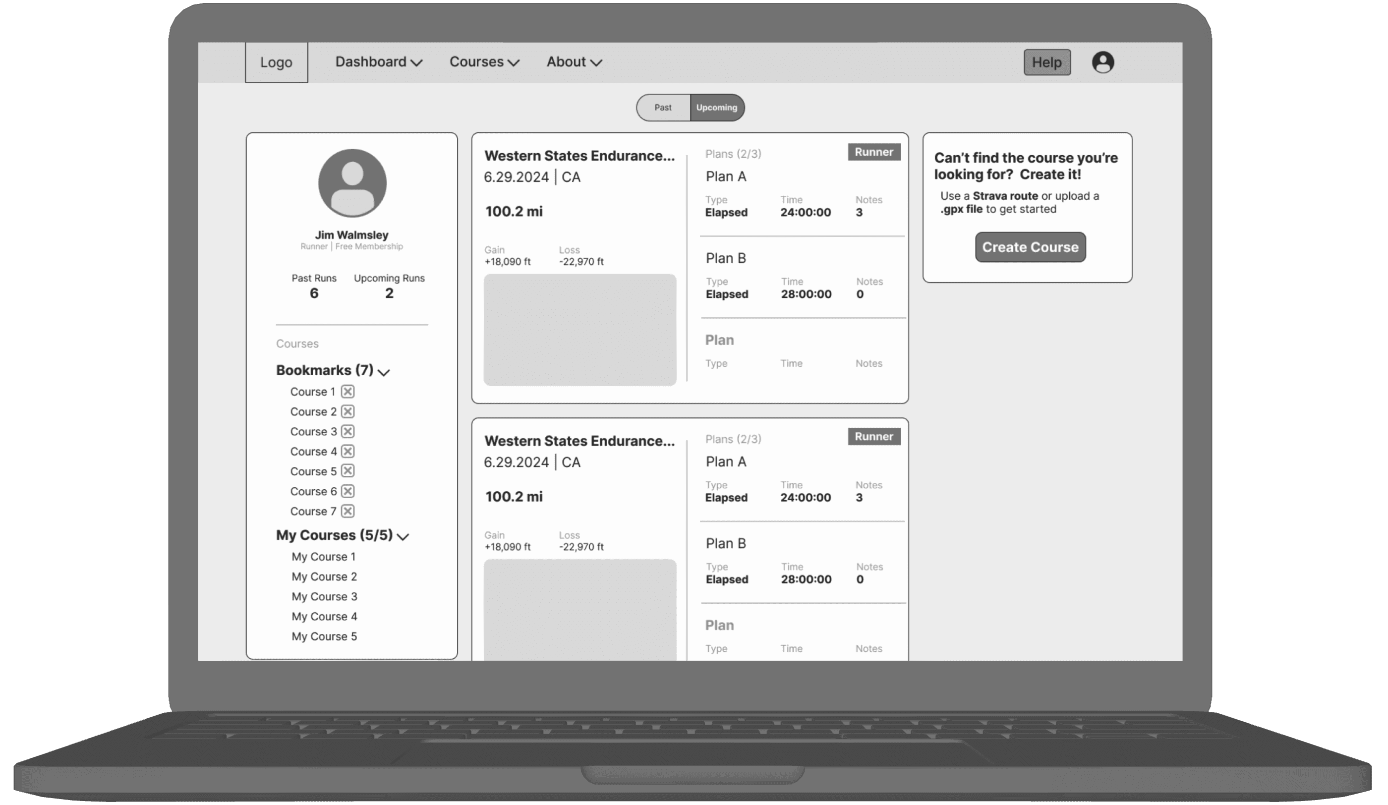
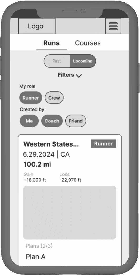
ultraPacer Athlete Dashboard
Run smarter to run harder
Client: ultraPacer
Role: Product Designer | Content Designer
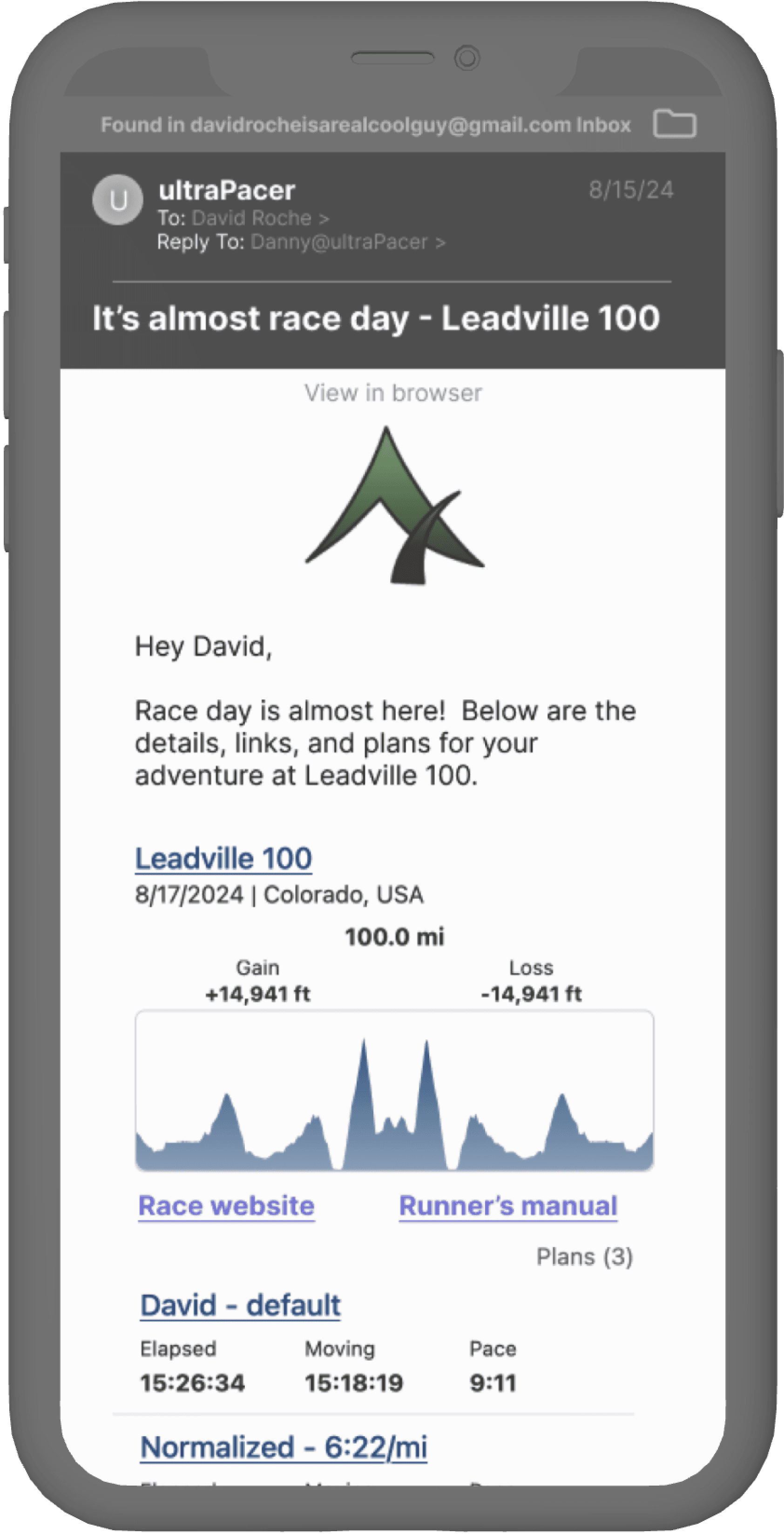
ultraPacer Pre-race Email
Getting everyone on the same sole page
Client: ultraPacer
Role: Product Designer | Content Designer
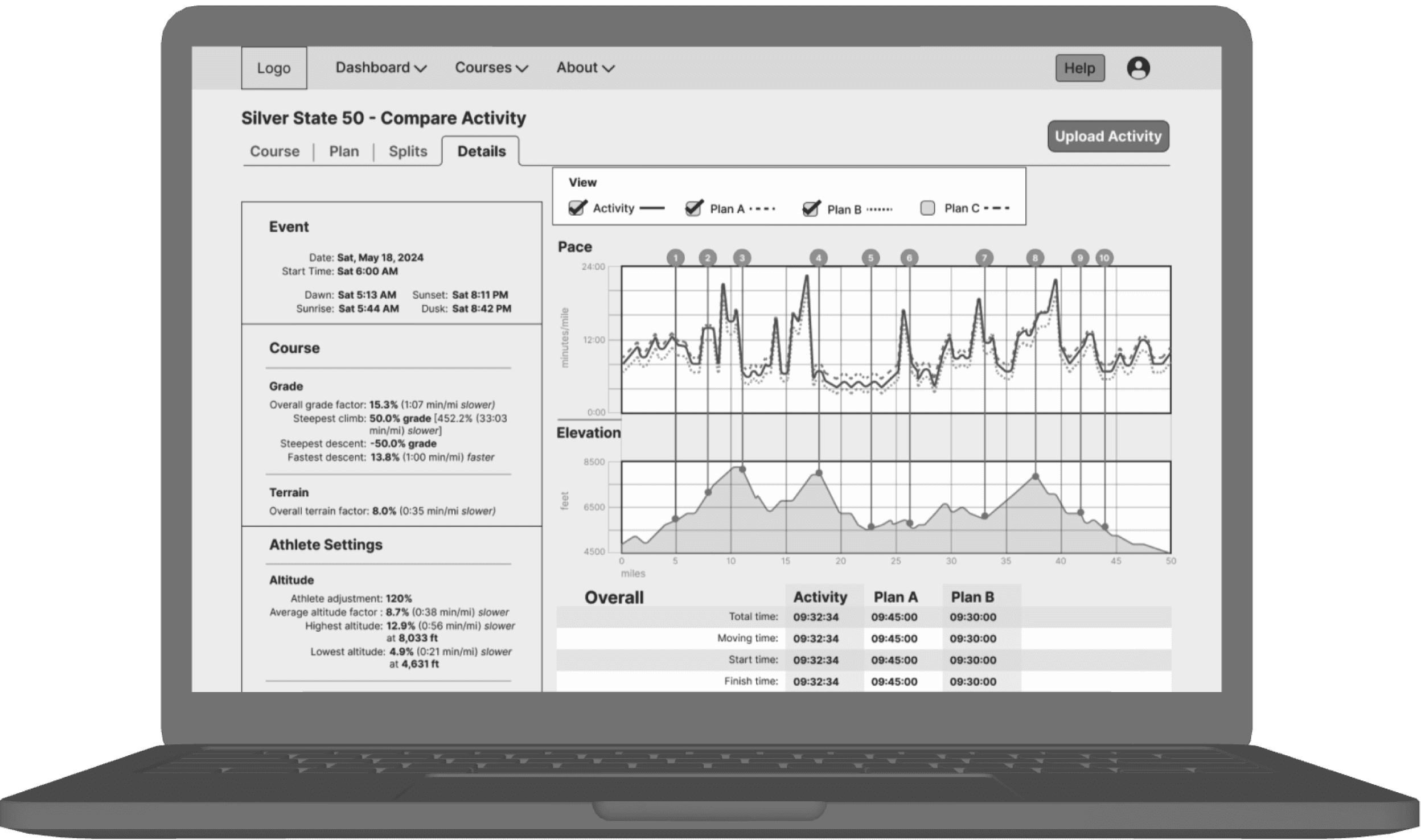
ultraPacer Compare Activity
Performance vs. the script
Client: ultraPacer
Role: Product Designer | Content Designer
